
November is all about colour in interiors
Colour doesn’t need a special introduction – it’s one of the most prominent elements in the design world. And with spring in full swing, what better time to talk about colour?
While furniture and décor can make for a stylish and functional interior, colour is the foundation of a well-executed space. Colours establish an aesthetic connection between objects and can influence our mood. So, in order to best utilise colour, you need to first understand how these colours behave.

Primary colour
Red, yellow, and blue are primary colours; these pigments cannot be made by mixing any other colours. Often associated with childhood, they are one of the most underutilised colours in interiors. They are clear, straightforward and bold – and when combined with geometric shapes can made a major impact in modern design. The Bauhaus era is a perfect example of well-placed primary colours within interiors.
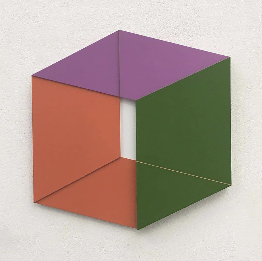
Image from Terra Arte
Secondary colour
As the name suggests, secondary colours – namely orange, green and purple – are created by mixing primary colours. Secondary colours have a similar effect to their primary counterparts – splashing a bold accent of secondary colour can invite real personality into a home. The key is to use these as an accent alongside other colours to create feeling.

Tertiary colour
Tertiary colours are the shades that can be made from mixing primary and secondary colours. They can be audacious and exciting; when paired with a complementary colour, they create a striking impression – perfect for those interiors that have a heavy dependency on neutrals. As with all tertiary colours, less is often more – inject small amounts of a stimulating tertiary hue to engage and elevate mood without overpowering the rest of the interior.

Monochromatic colour
Images of stark black and while interiors may come to mind when talking about monochromatic colour, but this isn’t the case. Rather, it’s a focus on one main colour that is applied consistently throughout an interior. Monochromatic schemes are easy on the eyes – and the key is to use a wide variety of shades to keep the colour choice interesting and create flow between spaces.

The Red Room by Behance.net
Analogous colour
Analagous colours are those found directly next to one another on the colour wheel. Utilising groups of analogous colours can create harmony and balance in a room – provided there is a main colour of focus. The other shades help create accents and interest without overshadowing the space.

Complementary colour
They say opposites attract – and this couldn’t be truer for two colours sitting directly opposite one another on the colour wheel. The contrast between these two starkly different tones creates excitement and visual interest. These two colours don’t have to be used in equal parts either – choose a dominant colour and let the contrasting colour be the accent or supplementary one.