
coral within a considered palette
living coral was the focus of this january 2019 colour archive. between pink and orange, the hue offered a warm accent to explore through finishes, art and smaller objects.
a colour reference is a starting point, not a reason to replace a well-functioning interior. our colour consultation service in melbourne considers undertones, light and adjoining materials before developing a palette.
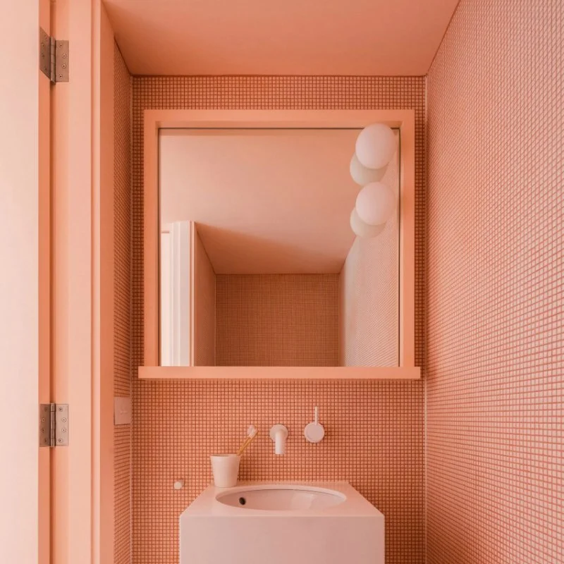
bathroom reference: tribe studio, sydney.
within tiled surfaces
the tribe studio bathroom reference carries a related colour through tile, joinery and framing. fixed finishes require a coordinated specification, with large samples and the proportions of the room considered before installation.
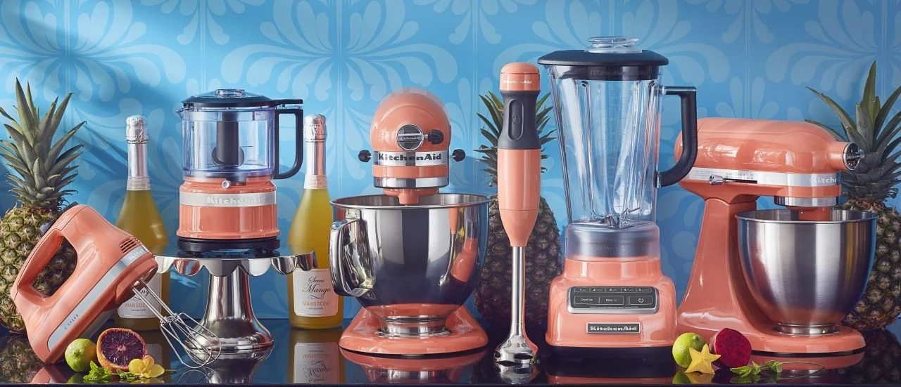
an everyday appliance
the kitchenaid reference brings colour to a practical object. performance and the available space should lead the selection, with the accent considered alongside the kitchen’s more permanent finishes.
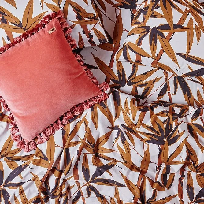
a textile accent
the kip & co cushion reference introduces colour through velvet. a small textile can shift an arrangement, with its tone and texture reviewed against the existing upholstery.
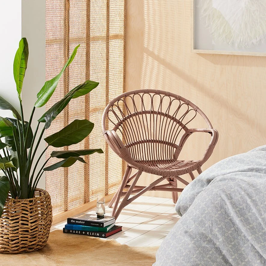
a coloured chair
the adairs oasis chair featured in the original selection. colour can give a furniture piece a distinct identity, but comfort, scale and suitability for its setting remain essential.
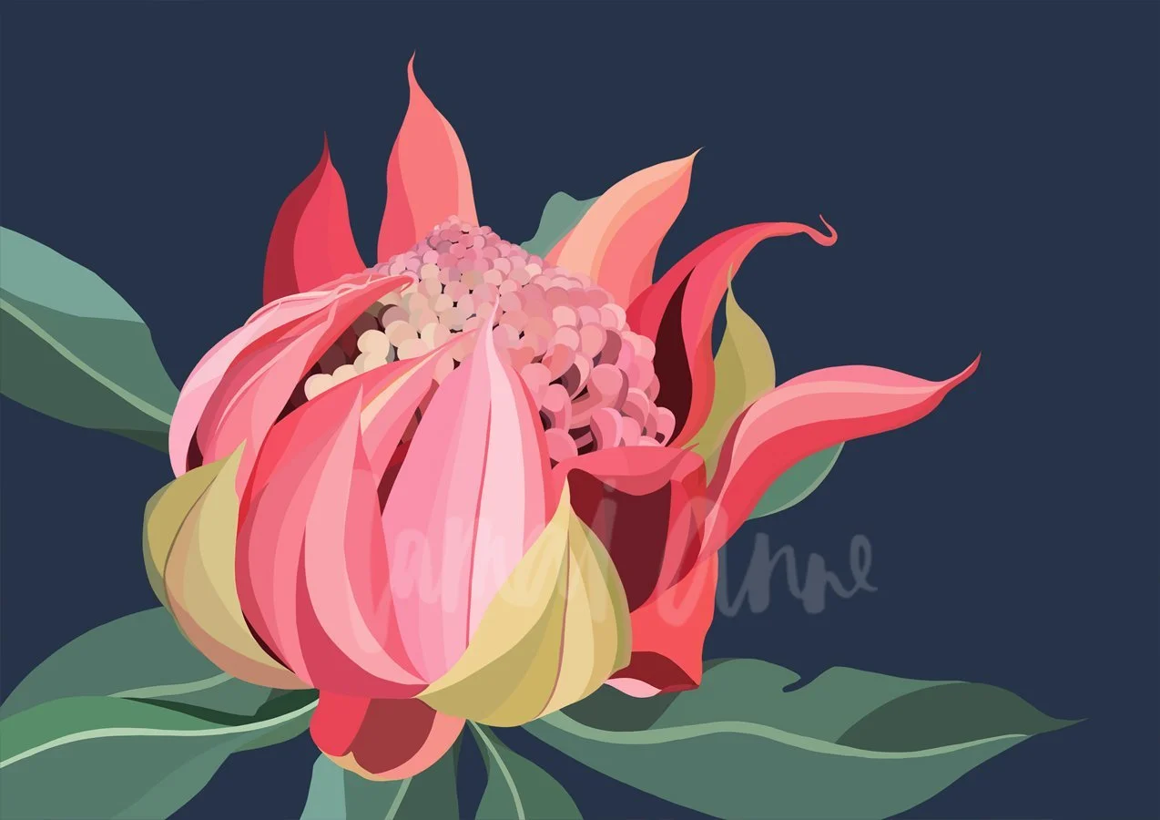
through art
lamai anne’s waratah bloom print brings coral into a composition with darker and cooler colours. art can inform a room’s palette while remaining a personal choice, supported by considered scale and placement.
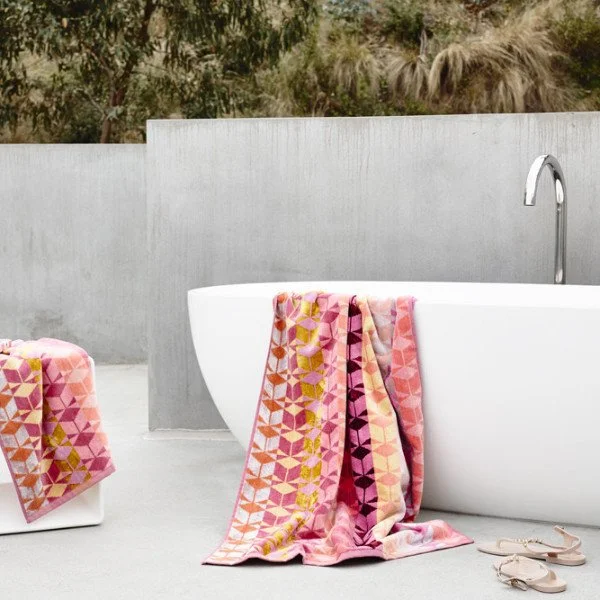
within bathroom textiles
the ziporah lifestyle acer towel reference explores a more expressive textile palette. towels provide a flexible layer of colour beside quieter stone, tile or joinery finishes.
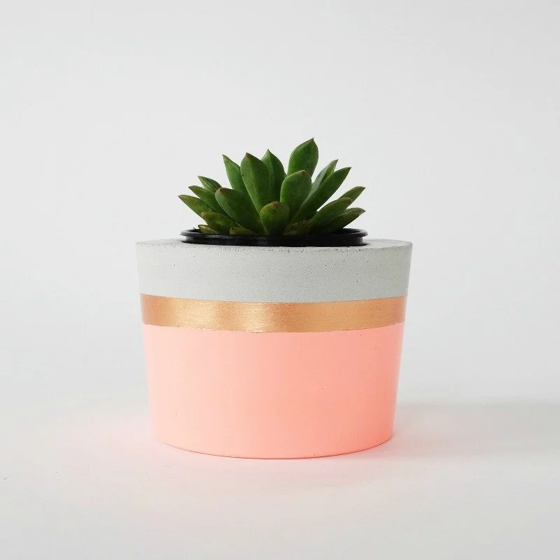
a smaller vessel
the coral and herb planter introduces a warm tone through a compact object. review its proportions and practical requirements alongside the plant and the surface it sits on.
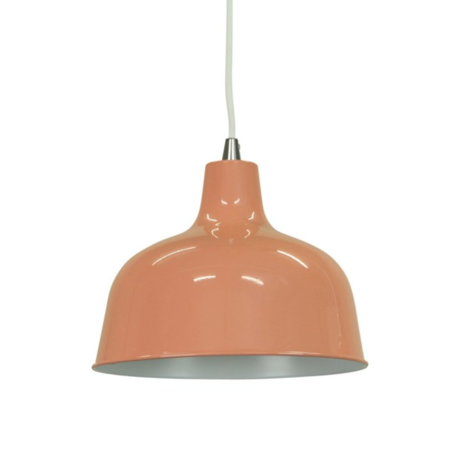
a pendant
the she lights dania pendant reference brings a warm colour into the room’s upper plane. its finish, suspension and lighting role should be considered together.
interior decoration and styling coordinates these layers with the broader interior. the products shown belong to the original 2019 archive, with current details to be confirmed with suppliers.