
depth in a neutral palette
a neutral palette can hold considerable depth. subtle shifts between timber, leather, glass and textiles allow texture and proportion to become more visible.
this 2019 selection, originally curated by cetti germano, explored earthy tones and muted green through furniture, art and lighting. it remains an archive of material relationships; current finishes and availability should be confirmed with the relevant suppliers.
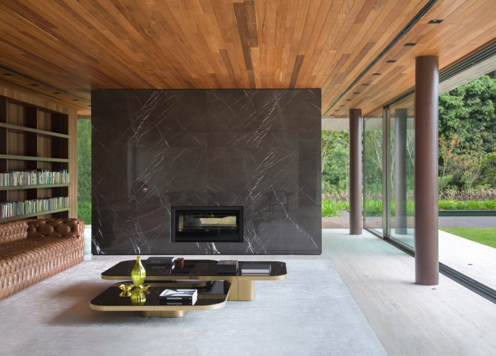
bow coffee table, classicon
polished glass and brass introduce different reflections within a restrained palette. the rounded base and floating appearance of the tabletop give the piece a distinct architectural presence.
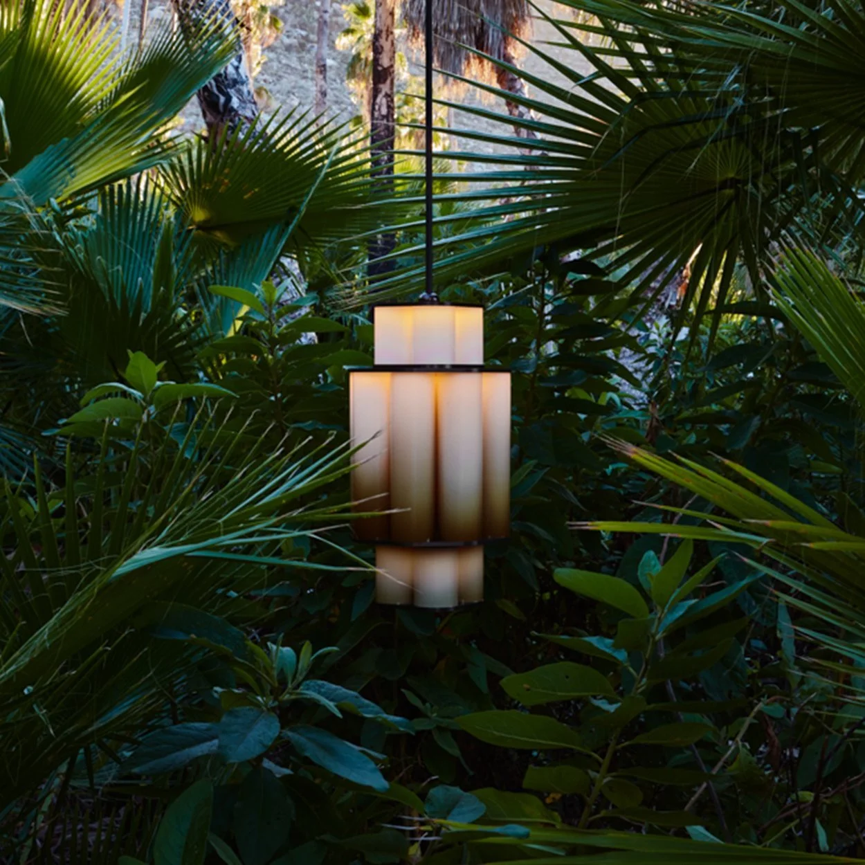
bauer chandelier 01, jason miller
clusters of tubular glass move from darker bronze tones to white. the gradual change gives the fitting depth, demonstrating how light and transparency can carry colour quietly.
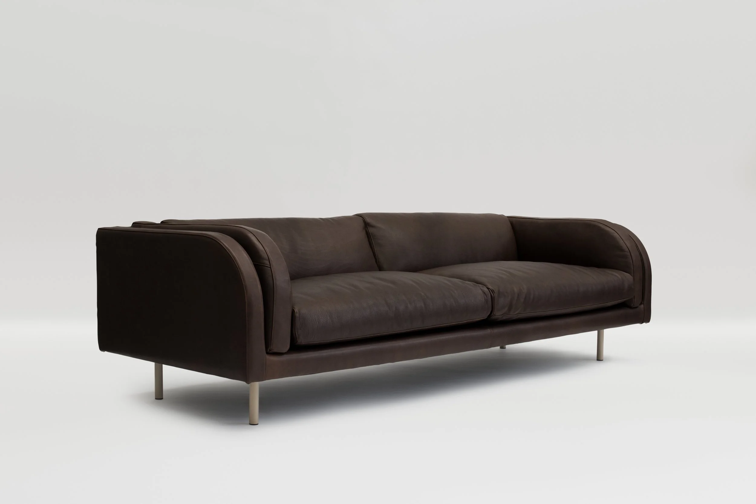
harvey sofa, grazia & co
curved arms soften the profile of the leather sofa pictured. its depth of colour offers a grounded counterpoint to paler surfaces and finer metal details.
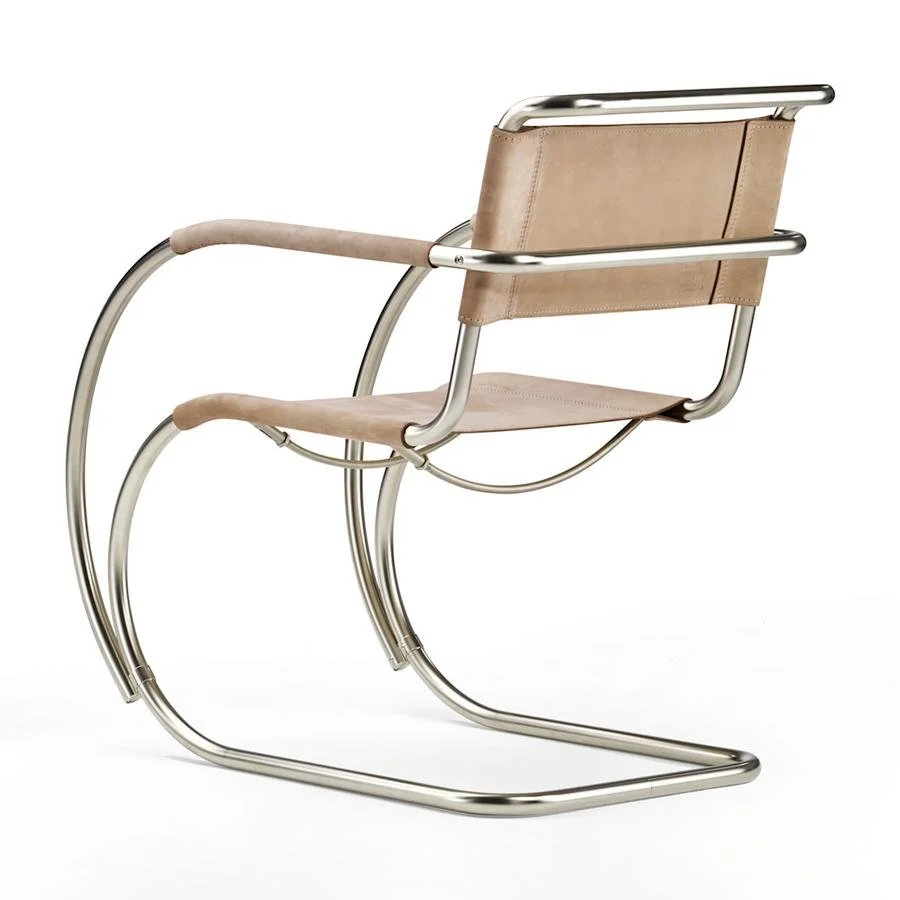
s 533 chair, thonet
curved steel and nubuck leather create a contrast between a fine structural frame and a tactile seat. the open profile can give a seating arrangement a lighter expression.
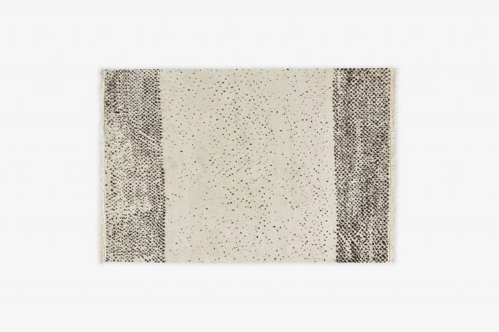
spreckels rug, jardan
the silk ground and wool detail described in our original selection bring texture into a close tonal range. review a rug alongside the room’s upholstery and flooring, allowing its surface to contribute to the composition.
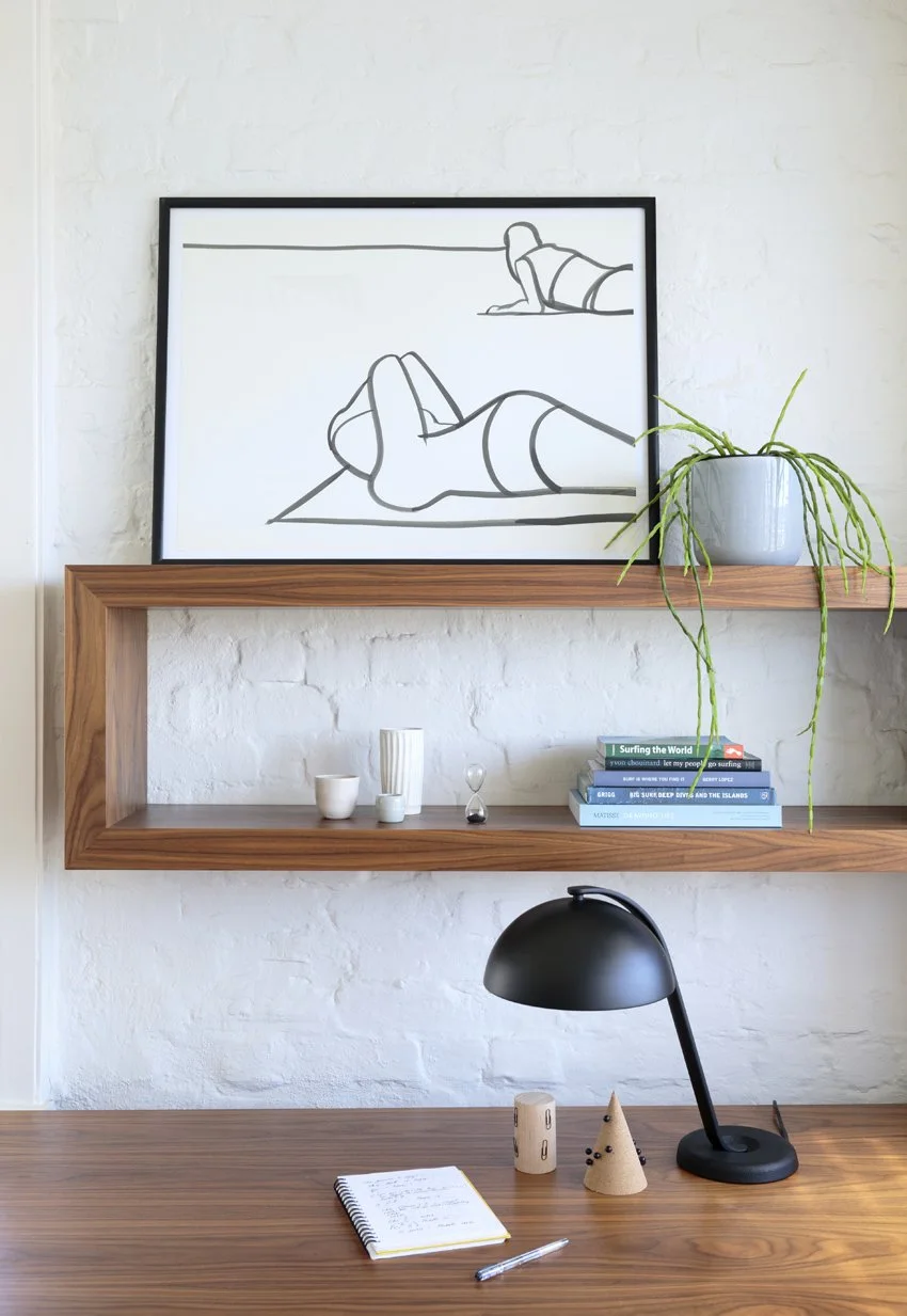
sun and sand, rebecca jones
an understated artwork can introduce another scale of mark and tone. its placement should respond to the architecture and the furniture beneath it, rather than simply filling an empty wall.
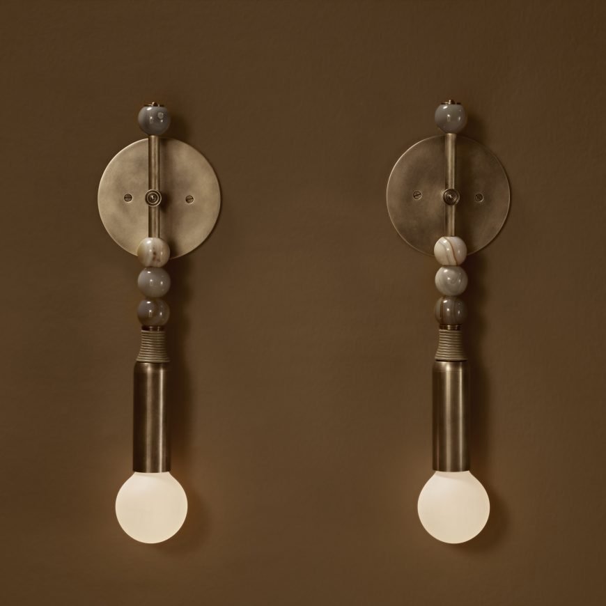
talisman sconce, apparatus
stone, leather and brass form a layered material composition. the earthy colours and muted green demonstrate how a small fitting can connect several tones within a room.
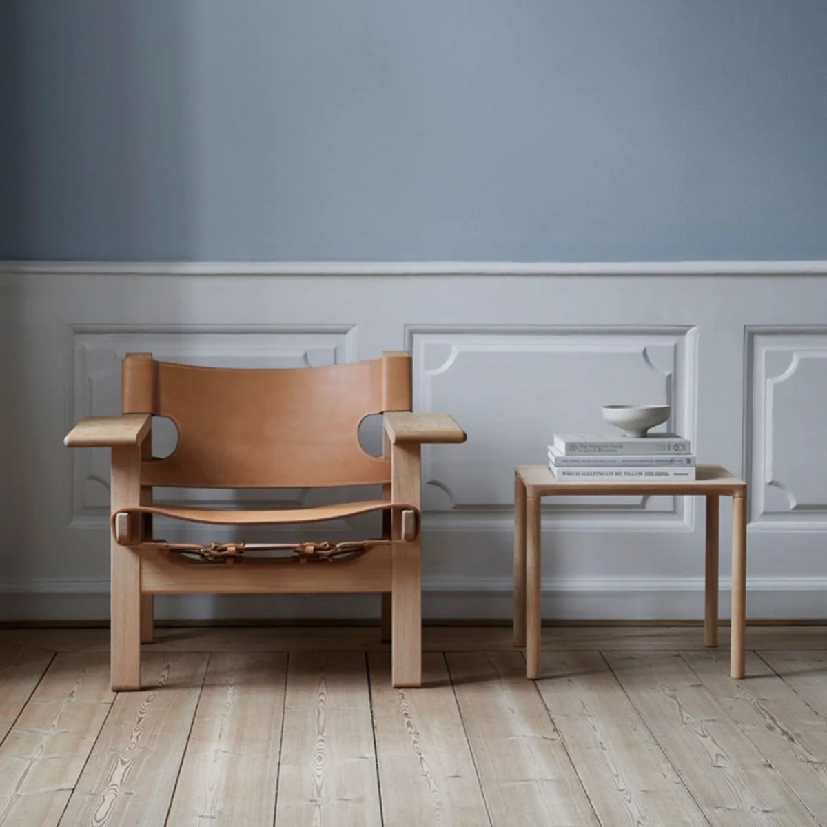
spanish chair, great dane
oak, leather and broad armrests give the chair a clear, generous silhouette. its material character sits comfortably within a palette that values texture as much as colour.
our essendon studio’s colour consultation and furniture selection consider these relationships within the particular light and proportions of a melbourne home.