
the subtleties of white
white is never quite neutral. a shift in undertone, light or neighbouring material can change its character, making the selection an important part of a complete interior palette.
for melbourne homes, we consider orientation, existing finishes and the atmosphere of each room before narrowing the options. these four steps offer a practical starting point.
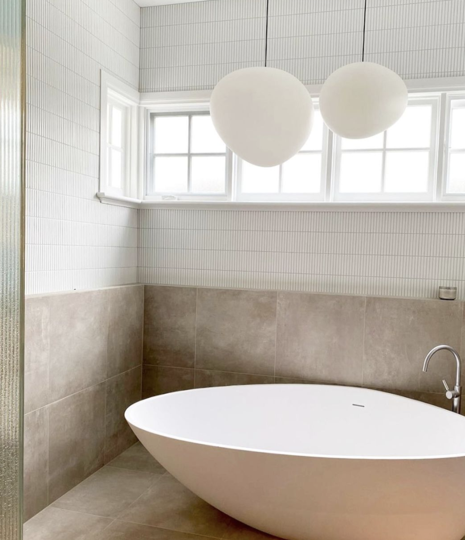
read the undertones
compare a small selection of whites side by side. some lean towards cream or pink; others reveal a cooler grey, blue or green undertone. a neutral reference can help make these differences apparent.
use sample cards to shortlist options, then move to larger painted samples. a small chip is useful for comparison, but cannot show how the colour will behave across a whole wall.
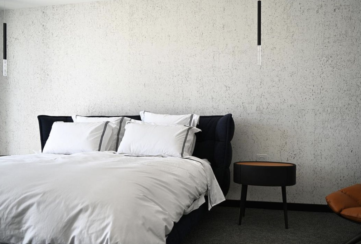
consider the complete palette
bring together samples of flooring, stone, joinery, upholstery and window furnishings. the surrounding materials influence how a white is perceived, so the paint decision should sit within the wider scheme.
look for a comfortable relationship between undertones rather than following a rule that warm materials always require a warm white. contrast may be intentional; what matters is how the combination feels in the actual setting.
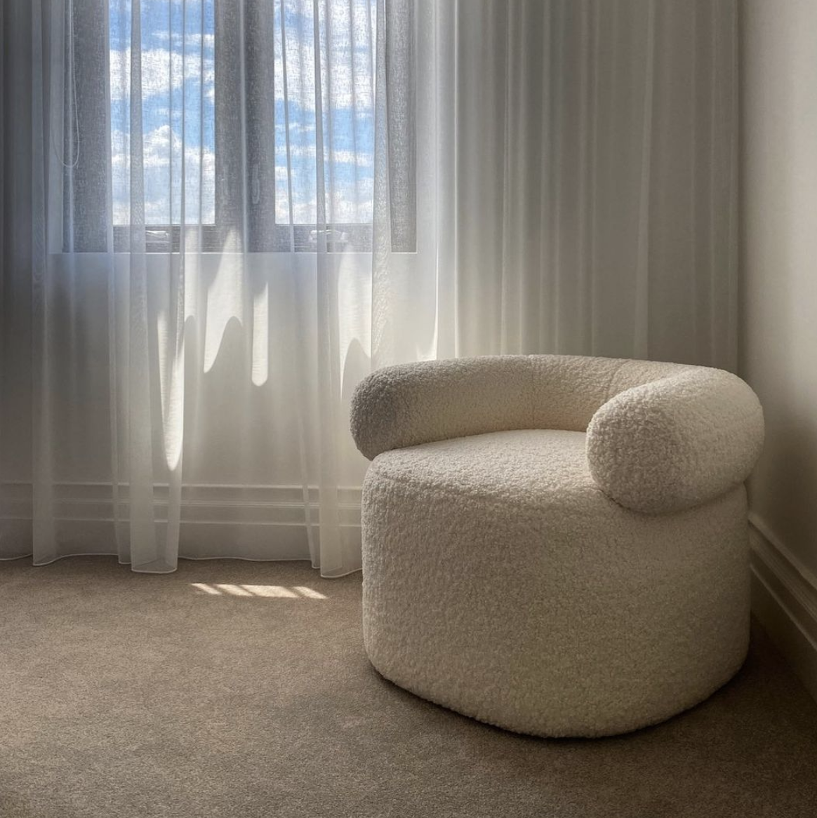
observe the light
review the room in the morning, afternoon and evening. orientation and reflected light can shift the apparent colour, while lamps and ceiling lights introduce another influence.
assess the samples under the lighting you intend to use. adjoining rooms should also be considered, particularly where an open plan connects several spaces.
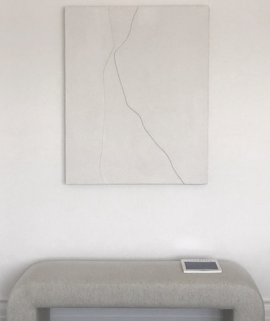
test before committing
paint generous samples on moveable boards and position them on different walls, beside the finishes that will remain. allow the paint to dry fully and view it over several days.
check walls, ceilings and trim together, including the intended sheen. these decisions are subtle, but they help establish continuity across the home.
our melbourne colour consultation coordinates paint with materials, finishes and furnishings. based in essendon, we approach the palette as one part of a cohesive interior design.