
Pantone colour of 2021: Two for the price of one
Pantone’s Colour of the Year is always a big blip on the design radar. With all eyes on them, it’s no easy feat coming up with a colour that captures the current mood and sums up the year ahead. This year, Pantone presents us with not just one, but two colours: Utlimate Gray and Illuminating.
It’s not the first time Pantone has given us two colours to welcome the new year, but it has been a little while since the last colour duo was announced in 2016.

The contrast seems very fitting for 2021 - the bright yellow shade, called Illuminating, is meant to evoke the “optimistic promise of a sunshine-filled day”, while Ultimate Gray is a much quieter hue that speaks more of “composure, steadiness and resilience”. We’re encouraged to look to the brighter yellow for hope, energy and clarity in a world set to face increasing uncertainty.
Pantone says the colours can almost be compared to durable natural elements, like time-weathered pebbles on a beach.

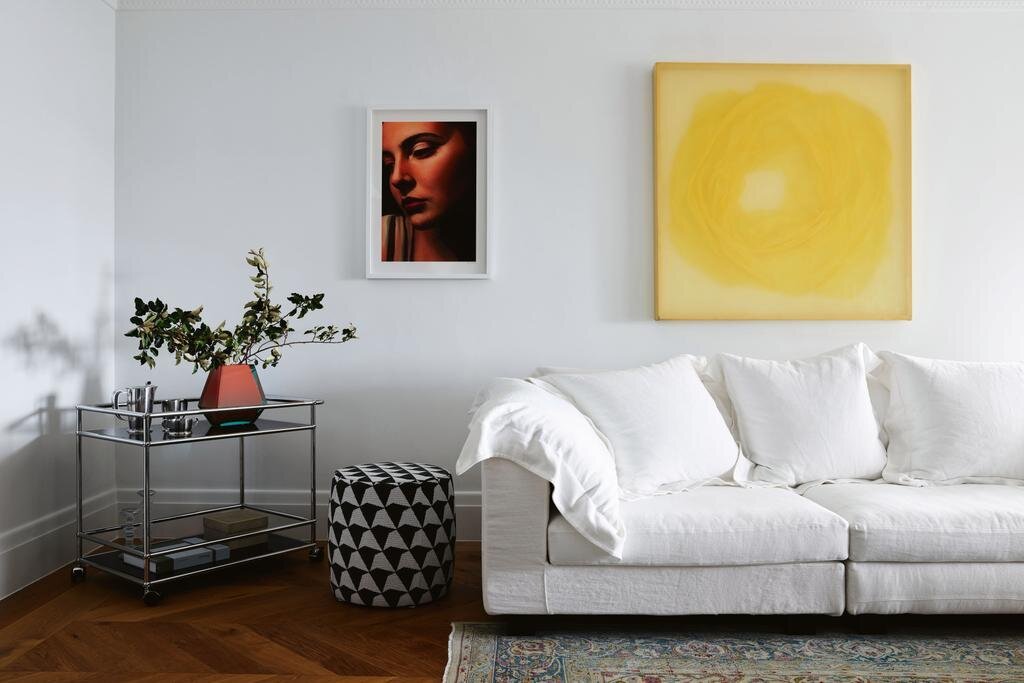
Photographed by Ambroise Tézenas and interior design by India Mahdavi. From an India Mahdavi-designed holiday home on the French Riviera
“The selection of two independent colours highlight how different elements come together to express a message of strength and hopefulness that is both enduring and uplifting,” explained Leatrice Eiseman, executive director of the Pantone Colour Institute.
So, how do you incorporate these colours into your home?
While house paint sales have spiked, the popularity of darker shades of grey have declined in favour of more organic colours like like blues and greens. This doesn’t really come as a surprise, however, considering what sort of a year 2020 was. But a mild grey like Pantone’s Ultimate Gray can provide its own kind of relaxation, offering a space that’s neutral both emotionally and physically. Think textured grey tiles, soft grey fabric sofas or beautiful matte grey stone benchtops.
Photographed by Anson Smart, interior design by Arent & Pyke and styling by Claire Delmar. From a Spanish-style mansion with Sydney Harbour views
Illuminating, on the other hand, is like an accent wall, providing some much-needed colour to keep things interesting. Add some yellow cotton waffle throws, a bold yellow artwork or fresh yellow dinner centrepieces.
“Practical and rock-solid but at the same time warming and optimistic, this is a colour combination that gives us resilience and hope,” said Eiseman. “We need to feel encouraged and uplifted, this is essential to the human spirit.”