
colour in relationship
colour is understood through its relationships. the same shade can appear different beside warm timber, pale stone or a darker wall, and will change again as daylight moves through the room.
first published in november 2019, this study considers familiar colour relationships as a starting point for a personal palette. our colour consultation service in melbourne develops these ideas through samples and the actual conditions of the home.
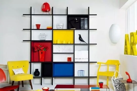
primary colour
the traditional artist’s colour wheel begins with red, yellow and blue. used in an interior, these clear hues can create a deliberate accent. proportion and the materials around them determine whether the result feels restrained or expressive.
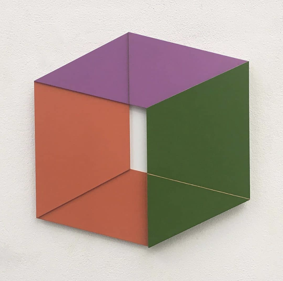
image reference: terra arte.
secondary colour
orange, green and violet sit between the traditional primary colours. a muted version can work across a larger surface, while a clearer hue may be introduced through art or a smaller object.
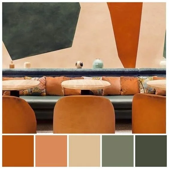
the colours between
the intermediate hues between a primary and its neighbouring secondary colour extend the palette further. their warmth, depth and saturation matter as much as their name on a colour wheel.
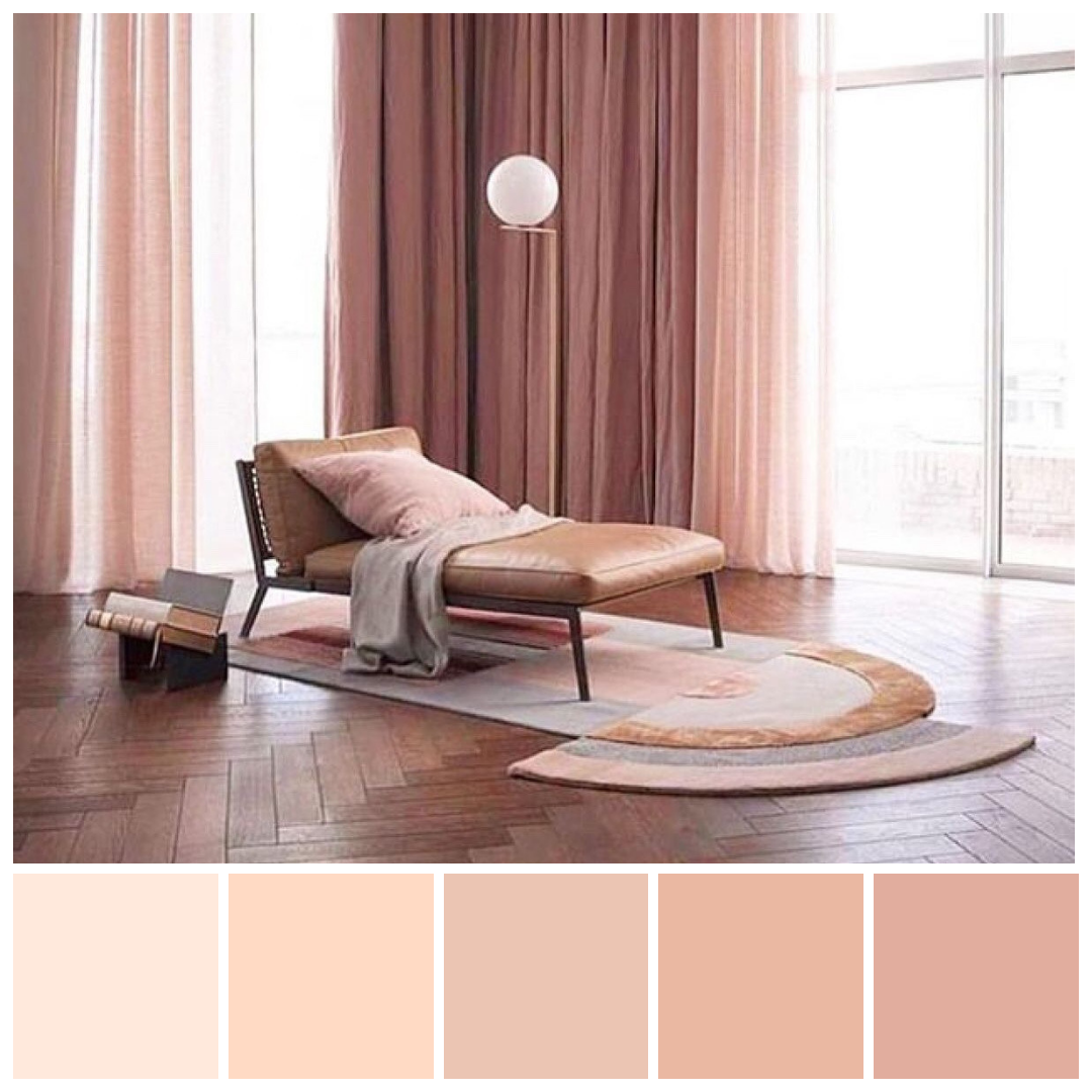
a single colour family
a monochromatic palette uses variations within one colour family. changes of tone, texture and sheen create depth, allowing related shades to move through a room without every surface looking identical.
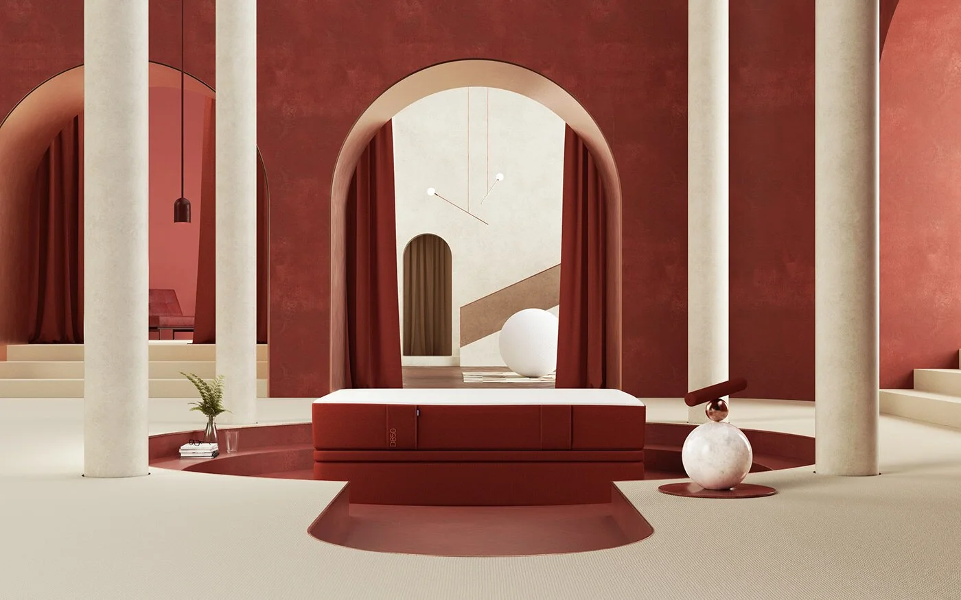
archive image reference: the red room, via behance.
neighbouring colours
analogous colours sit beside one another on the wheel. choose a principal tone, then consider how the neighbouring colours support it through fabric, finishes and artwork.
contrasting colours
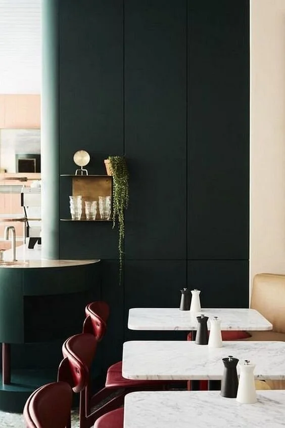
complementary colours sit opposite one another. the contrast does not require equal amounts of each: a smaller accent can be enough, especially when the underlying materials already have strong character.
materials and finishes specification brings colour into a coordinated selection, with samples reviewed together before decisions are finalised.