
blue, at different scales
classic blue was the subject of this january 2020 colour archive. its depth offered a starting point for exploring how one hue can move through an interior at different scales.
a palette is developed in context. our colour consultation service in melbourne considers daylight, adjoining finishes and the character of the home before a colour is specified.
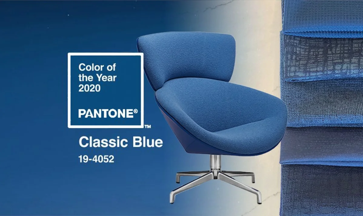
within the workspace
a blue lamp or upholstered chair can give a workspace a distinct identity. assess its relationship to the surrounding timber, wall colour and light, without allowing the accent to overwhelm a room used for concentration.
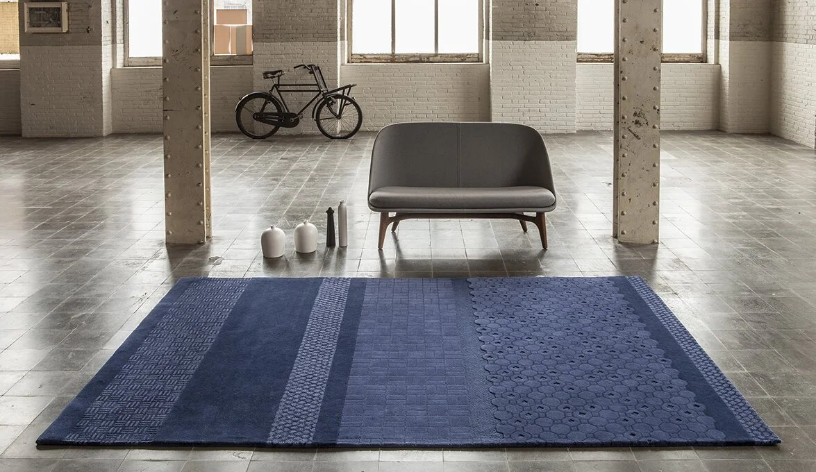
beneath the furniture
a blue rug introduces colour across a broad surface. view samples beside upholstery and flooring, considering the rug’s size, texture and maintenance as carefully as its hue.
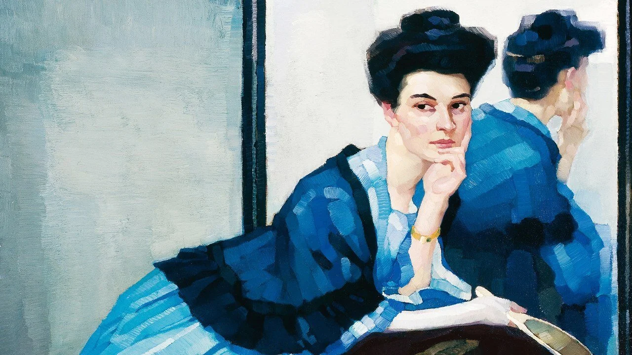
through artwork
art can provide the first colour reference for a room. select a work for its personal significance and composition, then allow one or two related tones to inform the wider palette. art selection brings scale and placement into that process.
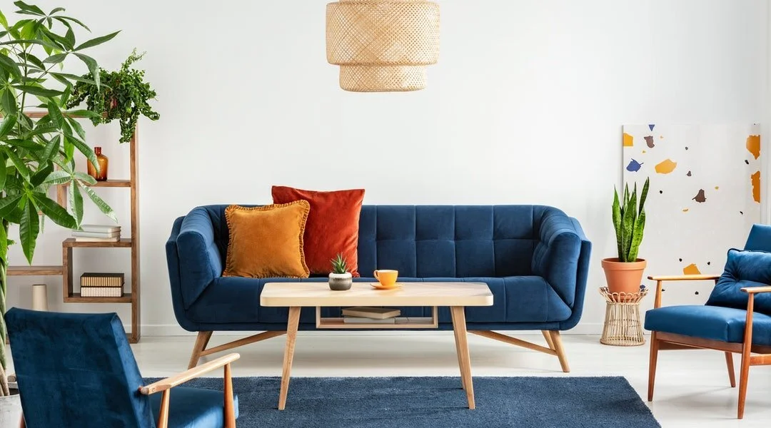
as upholstery
blue upholstery can hold the centre of a living space. a sofa should first meet the room’s requirements for comfort, proportion and use; colour is then considered alongside fabric performance and the surrounding furnishings.
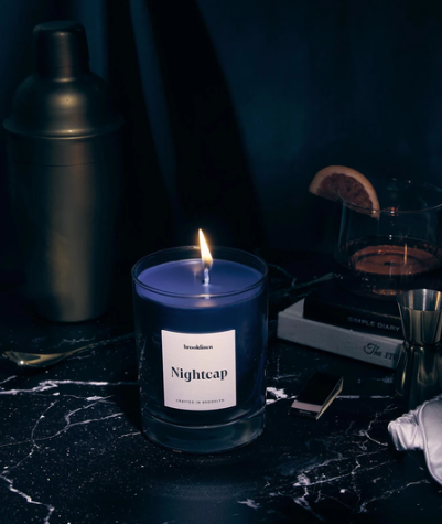
in smaller objects
a coloured vessel offers a measured way to introduce blue. a few objects with considered spacing can create a stronger arrangement than repeating the colour on every surface.
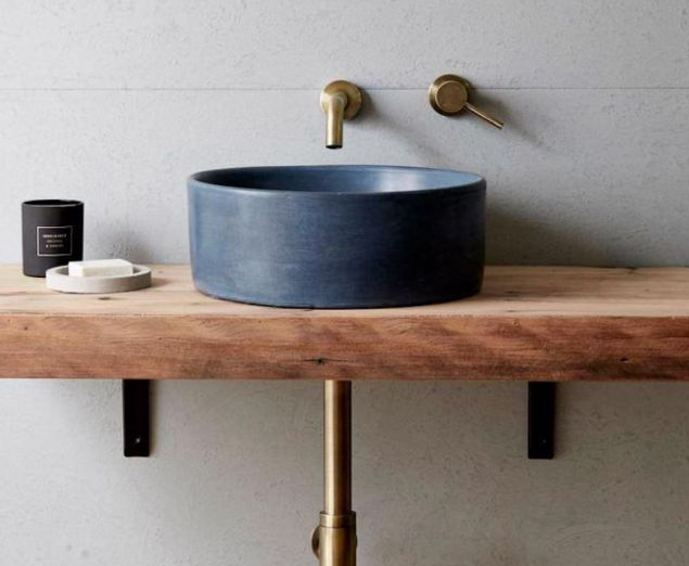
within joinery
a blue joinery finish needs to be considered with the stone, fittings and room’s light. durable fixed finishes deserve a longer view than an annual palette, supported by samples and a coherent material specification.
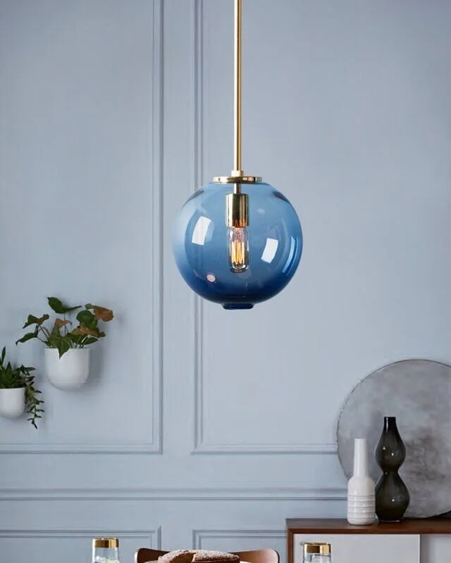
in a light fitting
a blue fitting can contribute colour even when the light is off. review its silhouette, suspension and lighting requirements alongside the room plan.
interior decoration and styling coordinates these layers, allowing colour to connect the interior without dominating it.