
colour in context: dulux 2021
dulux’s 2021 forecast brought together three palettes: retreat, nourish and reset. first discussed here in september 2020, they remain an archive reference for the relationships between warm neutrals, muted tones and more expressive colour.
a forecast can introduce a direction, but a home requires its own palette. our melbourne colour consultation considers natural light, architecture and existing materials before translating inspiration into a specification.
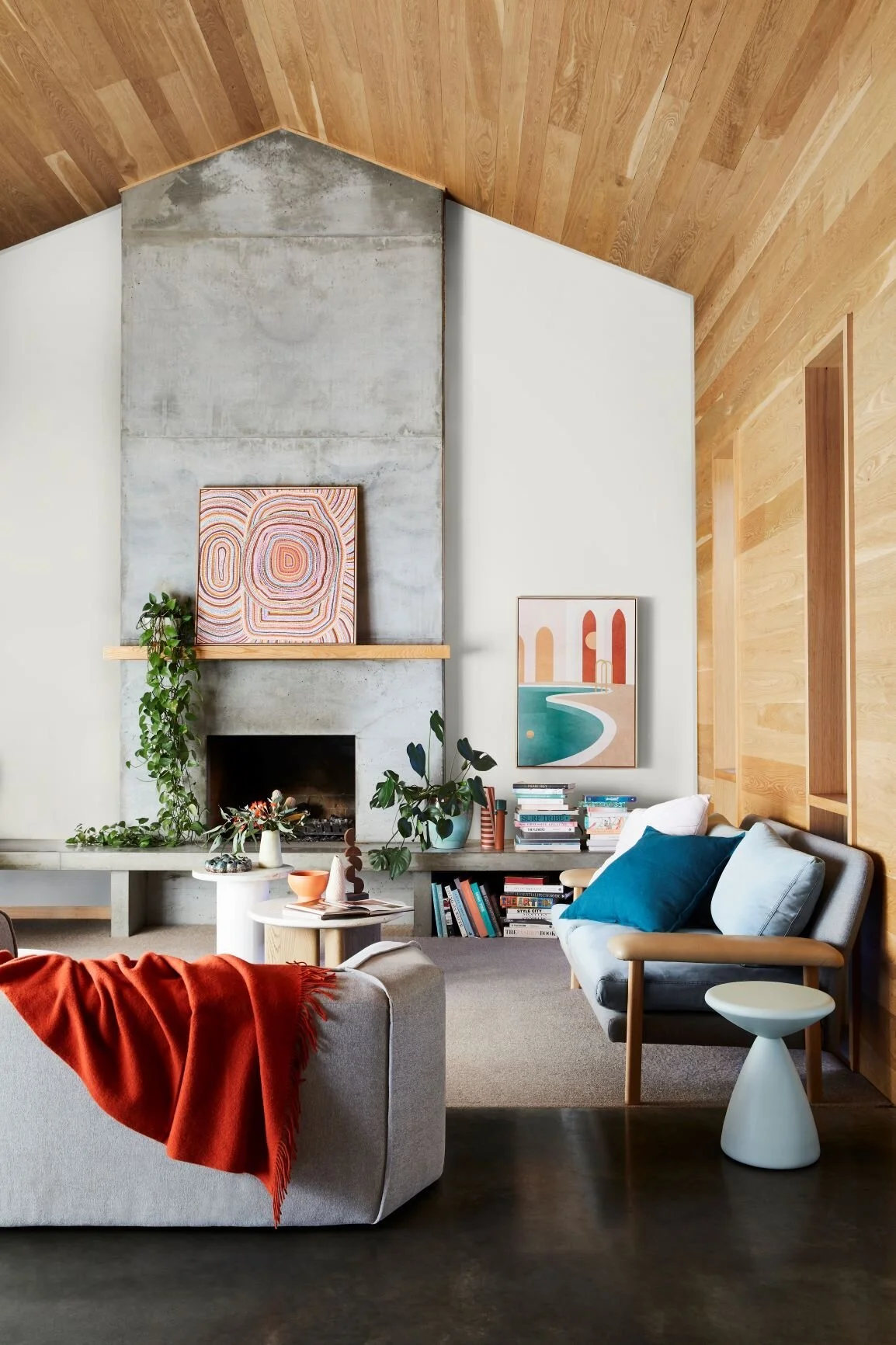
colour in context
the dulux imagery in this archive shows how a colour changes through its neighbours. upholstery, timber and the finish of a wall all contribute to the way a palette is experienced.
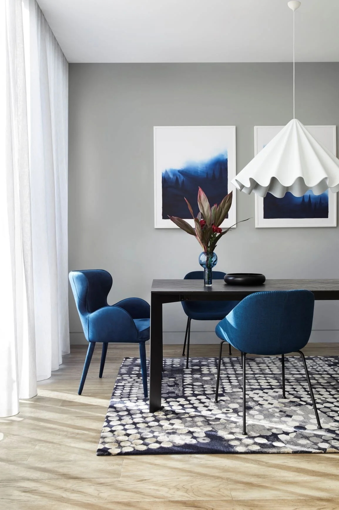
a connected interior
rooms used for work and everyday living benefit from a palette considered as a whole. transitions can be subtle, with shared undertones connecting different spaces while allowing each room its own character.
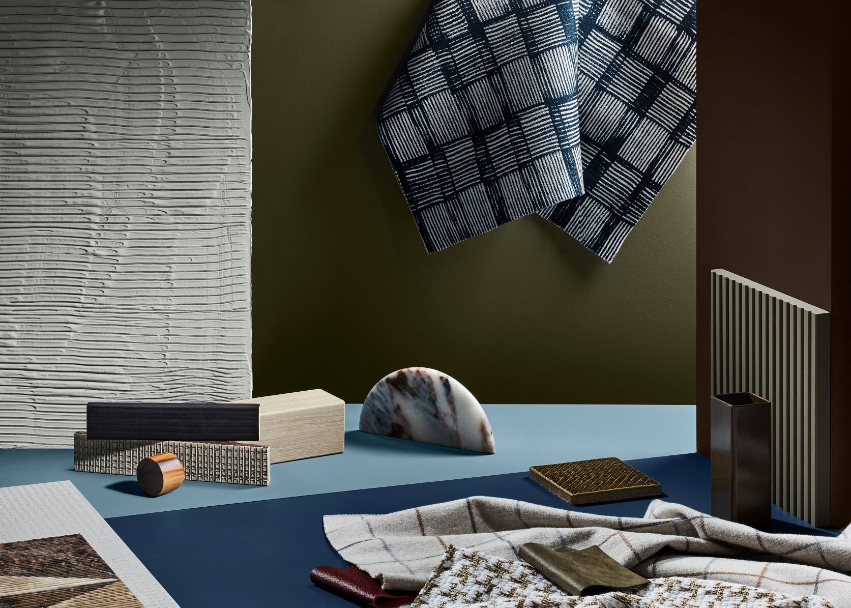
retreat
the retreat palette brings warm whites and brown-based neutrals into conversation with dusty blues, burgundy and deeper blue tones. its contrasts offer a reference for layering quieter surfaces with more pronounced accents.
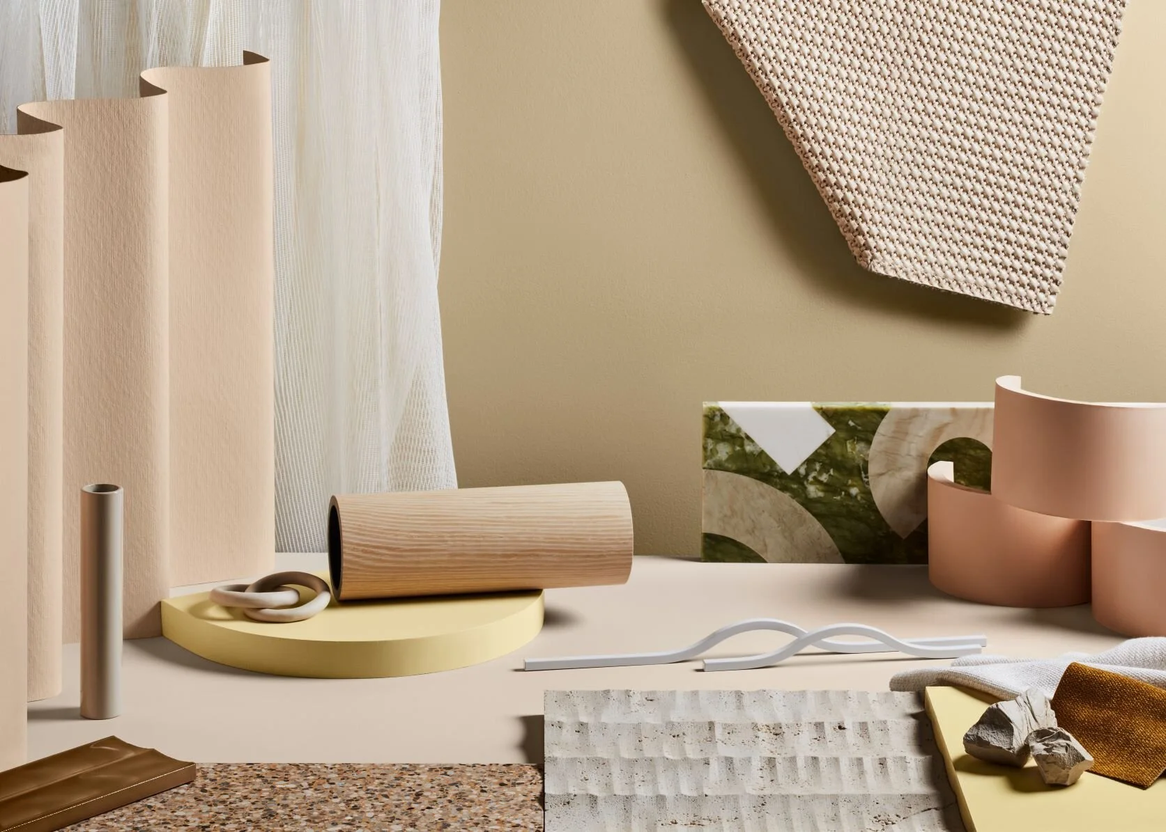
nourish
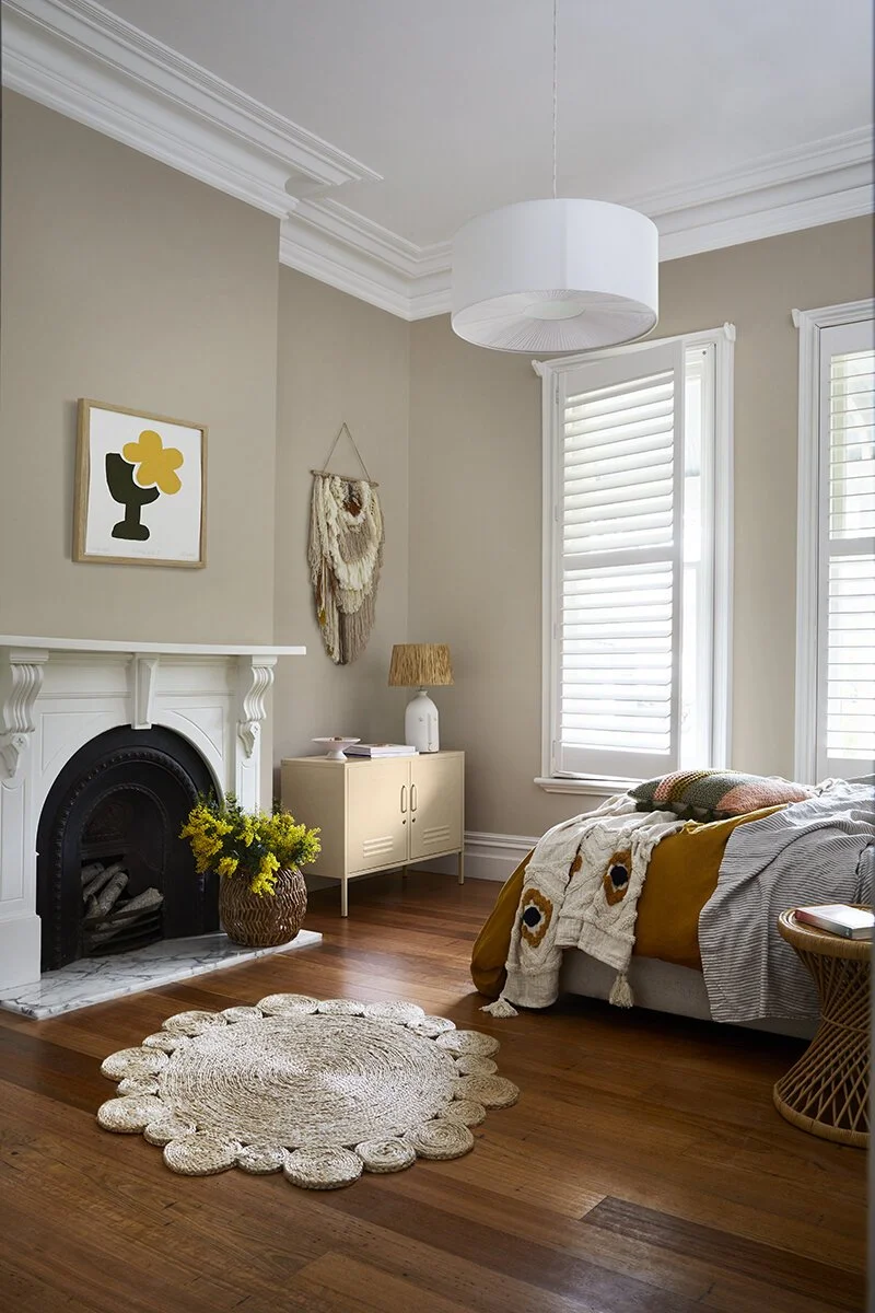
tan, soft olive and muted ochre give nourish its earthy direction. texture is important here: matte surfaces, woven textiles and the variation within natural materials can keep a restrained palette from feeling flat.
reset
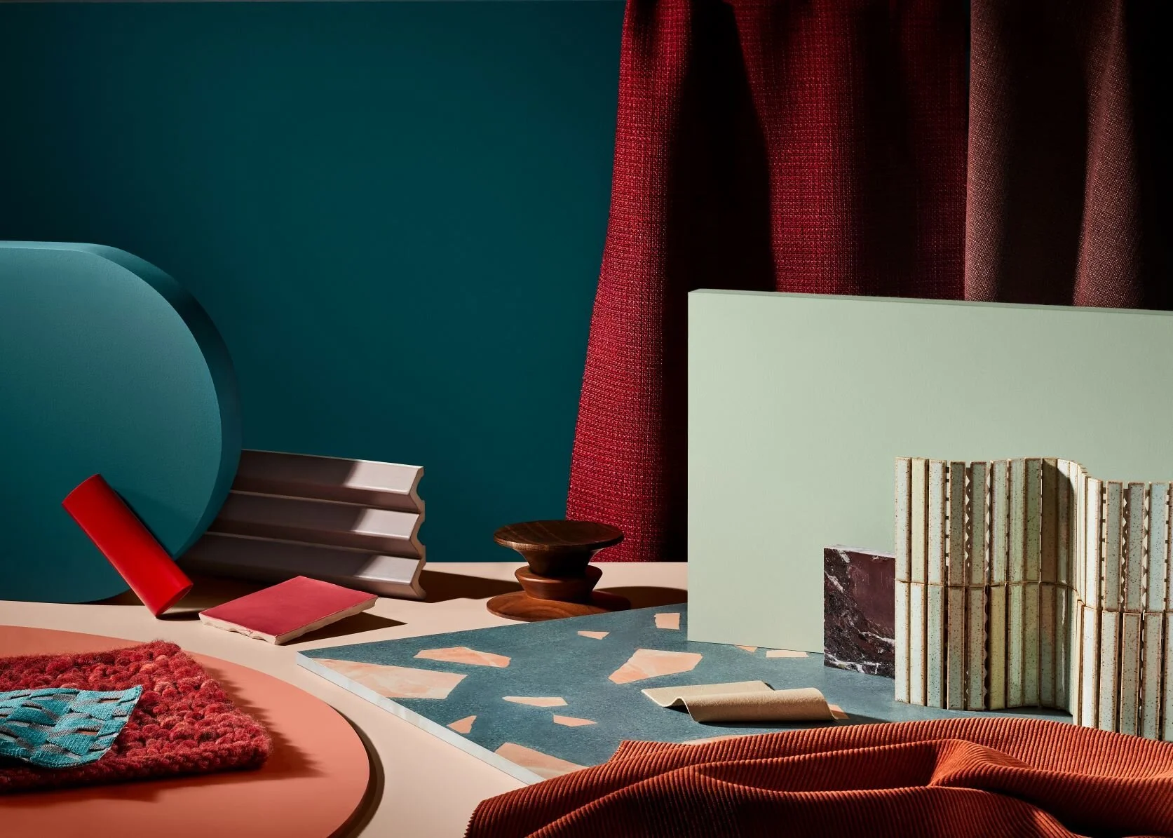
reset introduces blue, coral, rust, pink and terracotta. rather than using every hue, consider which relationships suit the room and the pieces already in it. a smaller selection may carry the intended character more clearly.
begin with what remains
flooring, stone, joinery and furniture establish a starting point. place paint samples alongside these finishes and observe them throughout the day. undertones and reflections are often more apparent in the actual room than on a screen.
translate the reference
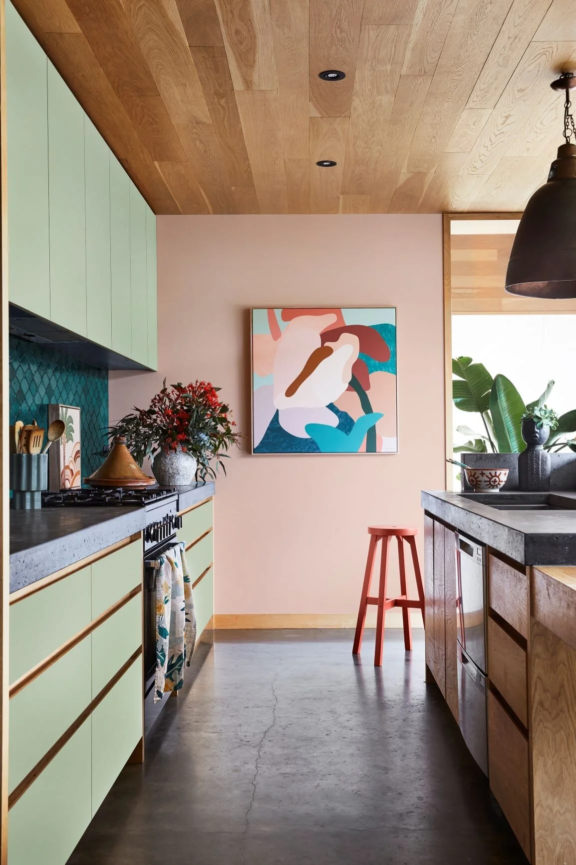
the value of an archive palette lies in the ideas it opens up, rather than a formula to reproduce. materials and finishes specification coordinates those ideas with the practical requirements of the project.
from our essendon studio, we develop colour with clients as part of a personal and cohesive interior. dulux is credited for the 2021 forecast and imagery discussed here; current colour ranges should be confirmed before selection.