
very peri: a study in colour
pantone introduced very peri, 17-3938, as its colour of the year for 2022. this december 2021 archive looks at that periwinkle tone as a point of departure for interiors, rather than a colour every home needs to adopt.
the original announcement is available from pantone. its blue and violet-red relationship invites a closer look at undertones and the way adjoining materials change a colour’s appearance.
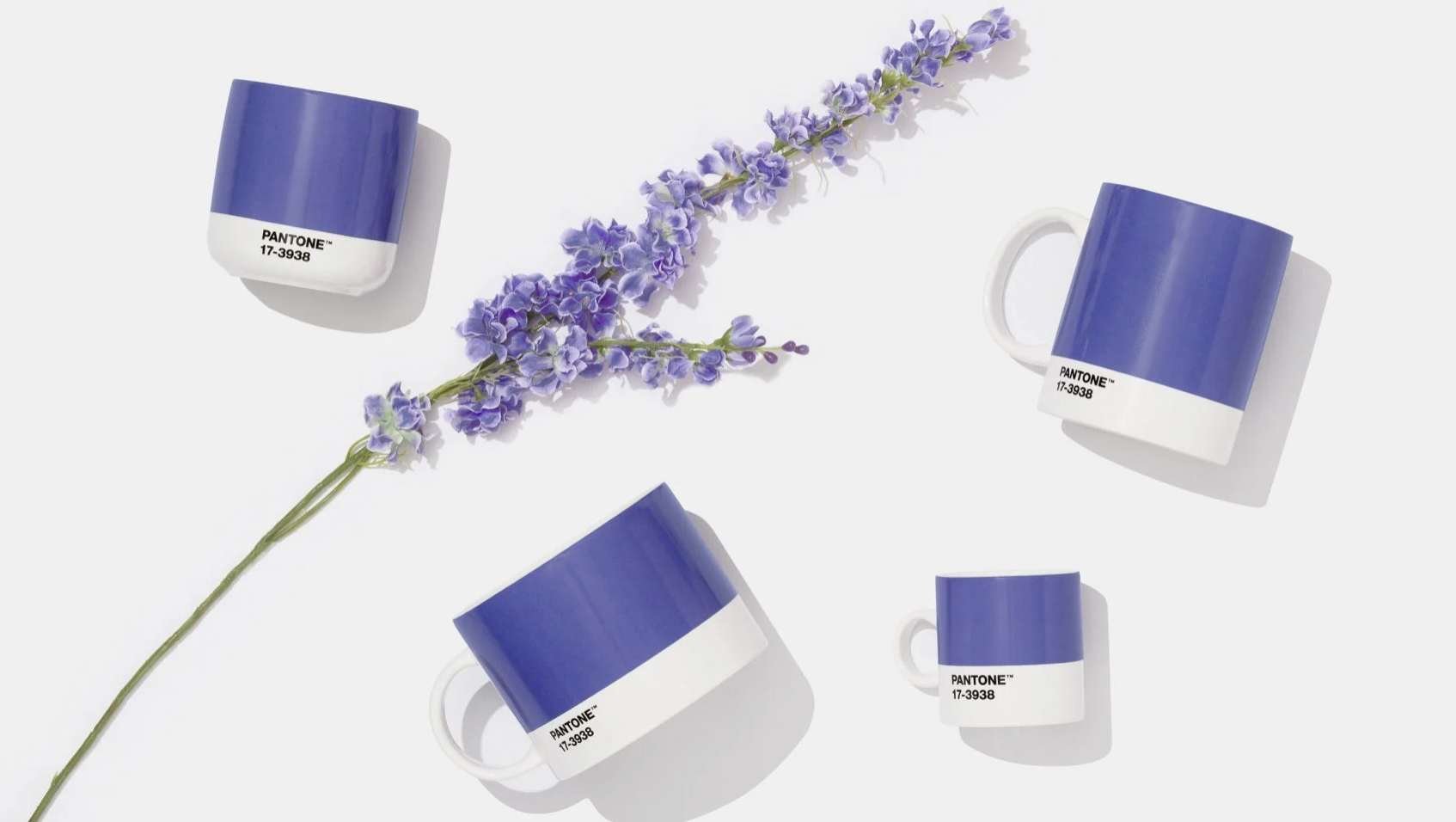
a reference, not a prescription
an annual colour selection can open a conversation about a palette. the useful question is how a tone relates to the actual interior: its daylight, timber, stone, upholstery and art.
our colour consultation in melbourne starts with those relationships, using physical samples to explore a direction suited to the home.
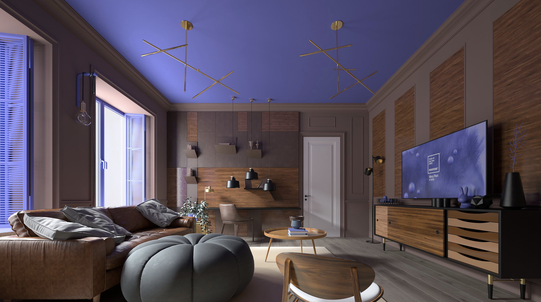
the scale of colour
a blue-violet tone can be introduced through a small object, a textile or a more substantial surface. the scale of its use changes its role: a quiet accent may connect to an artwork, while a larger application can establish the room’s character.
neither approach requires reproducing a forecast palette in full.
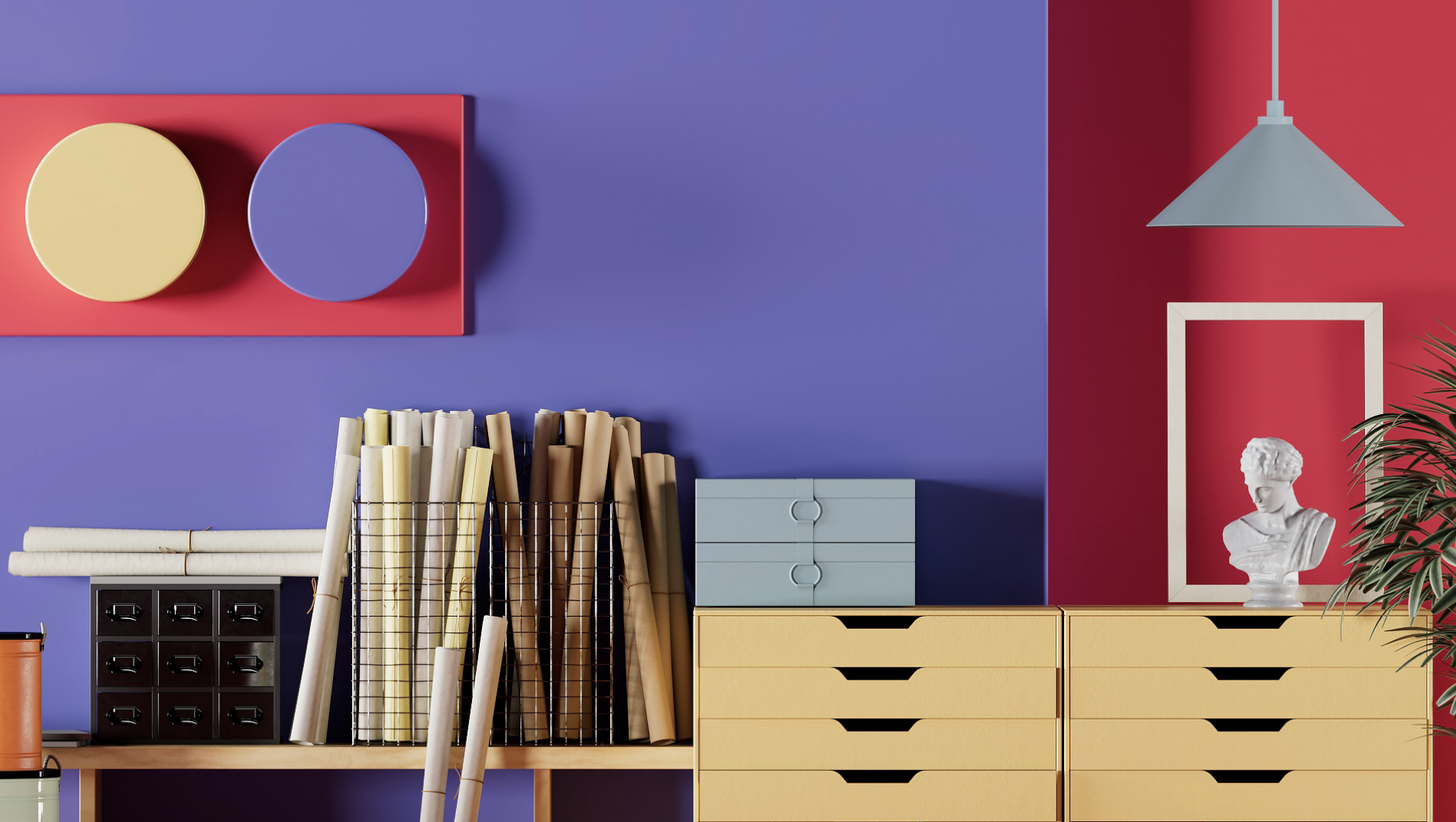
translate it through materials
the same colour behaves differently in wool, glazed ceramic and a painted wall. view samples beside the existing finishes and under both daylight and evening lighting.
interior decoration and styling brings these decisions into a cohesive whole, allowing colour to support a personal interior rather than a passing trend.