
confidence through collaboration
confidence in an interior grows through a clear design process. a shared understanding of the brief allows clients and designers to explore ideas with purpose, supported by drawings, samples and open conversation.
a collaborative approach
proportion, colour and material are considered together, with each decision responding to the architecture and the way the home is used. an unfamiliar finish need not be chosen simply to be bold; it should have a convincing place within the complete design.
our melbourne interior design practice works closely with clients and the wider project team. the following archive references explore how a deliberate choice can give an interior its own identity.

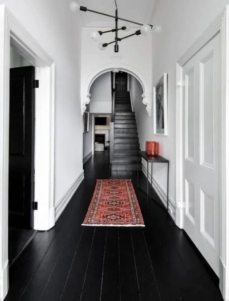
dark flooring and pale walls establish a clear contrast. the effect depends on the room’s light, proportions and the quieter details around it.
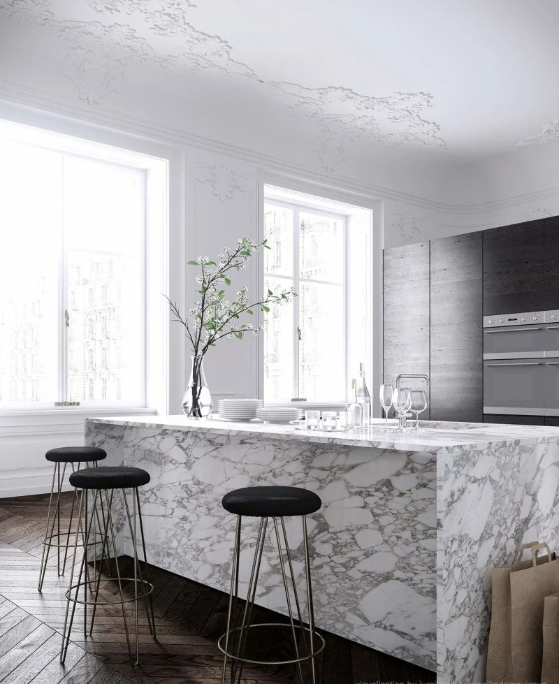
in this parisian apartment reference, chevron timber flooring provides rhythm while a strongly veined marble becomes a focal point. the surrounding palette allows both to retain their character.

a personal interior can reflect more than a single recognised style. the aim is a coherent composition that belongs to the client, rather than a set of rules followed without context.
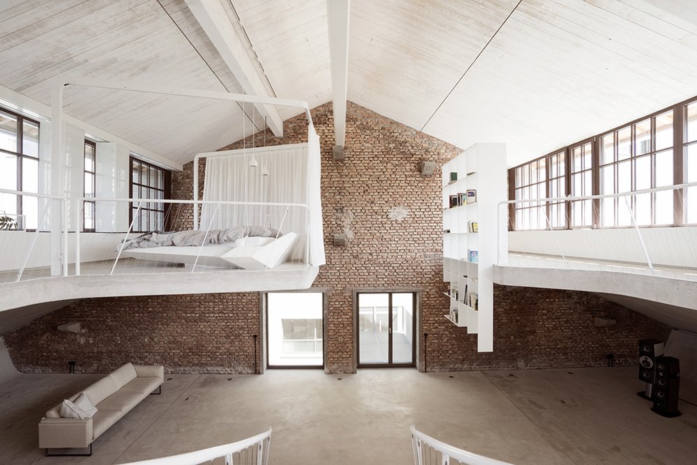
curved forms introduce another geometry into a large space, connecting the mezzanine with the architecture below.
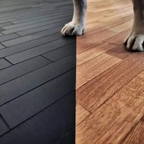
review choices as a group. a material’s role becomes clearer when seen alongside the other surfaces and proportions in the room.
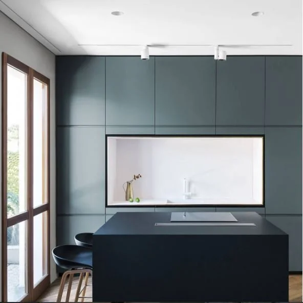
teal joinery gives this interior a distinct colour identity. test such a choice within the actual light and against the permanent materials before committing.
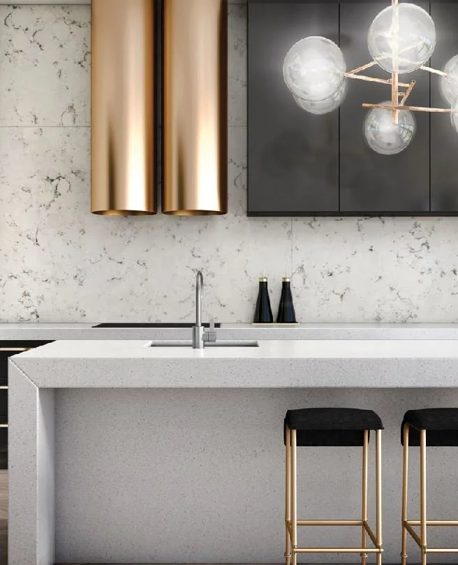
brass, stone and dark joinery form a connected palette. the stools and rangehood contribute their own scale and shape within the larger composition.
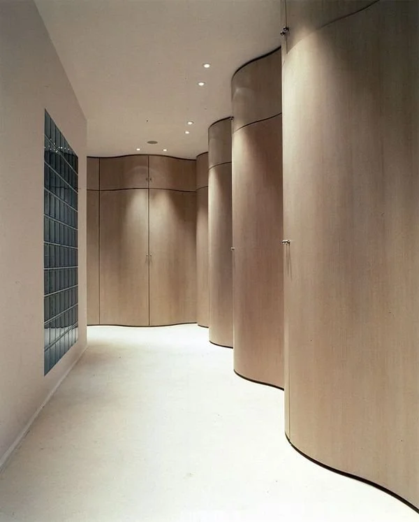
a curve can soften a junction or provide a sculptural point of interest when its geometry is carefully resolved.
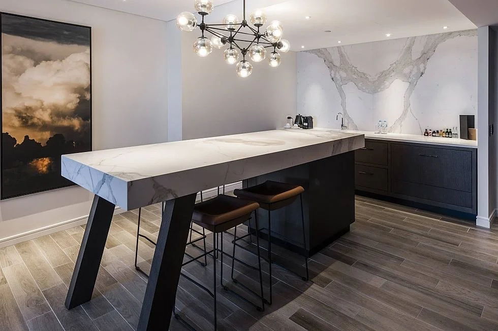
an island can be considered as a piece of furniture, with its own proportions and material expression, while retaining the practical requirements of the kitchen.
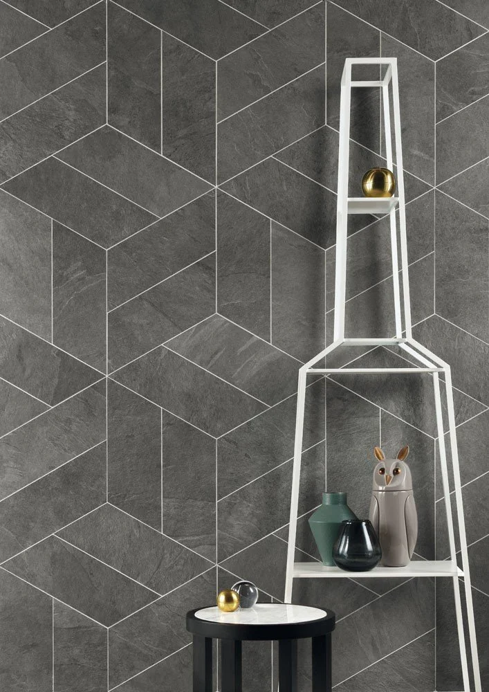
tile selection brings colour, pattern and texture together. review a larger sample or layout where possible, including the grout and the edges of the proposed application.

a personal point of view
iris apfel remains a reference in our archive for an expressive approach to personal style. within a home, that expression should emerge through the client’s preferences and the considered relationships between pieces.
from our essendon studio, colour consultation and materials specification help make these decisions tangible, giving the design a clear foundation before construction.