
edition
notes on materials, objects and the details that shape an interior. from our essendon studio, we consider colour, craft and the relationship between a home and the people who live within it.
selected references from our design archive, revisited through a contemporary perspective.
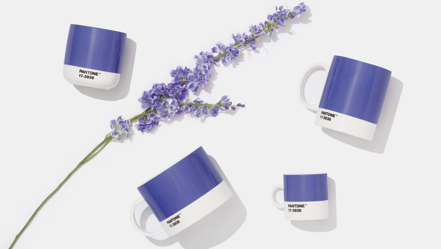
very peri: a study in colour
pantone’s 2022 very peri revisited through undertones, materials and the scale of colour within an interior. a reference from our design archive.
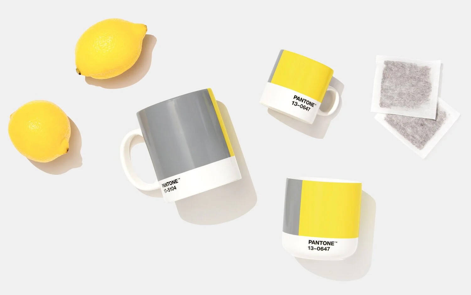
grey and yellow, in conversation
ultimate gray and illuminating, revisited through contrast, undertones and scale. a paired palette from our january 2021 archive.
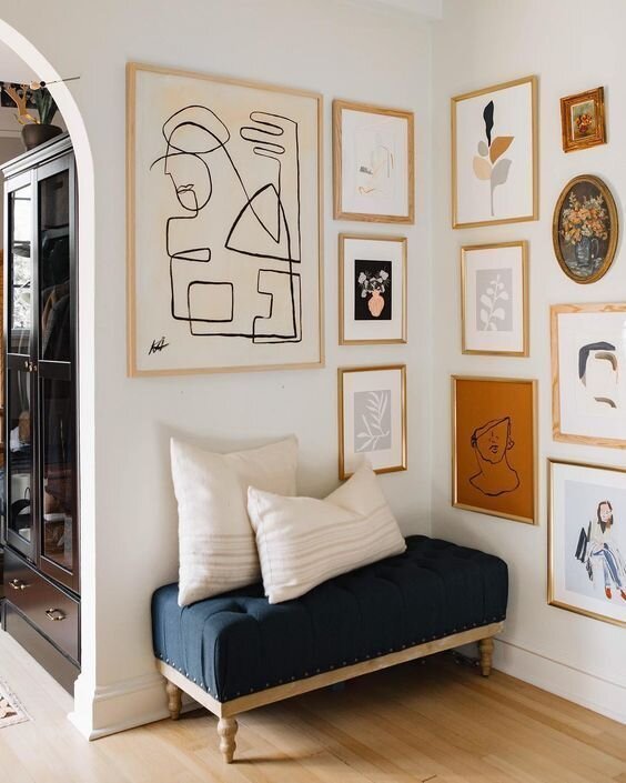
small shifts within the interior
reconsider an arrangement, give art its place and layer colour with texture. small adjustments that begin with the pieces already within a home.
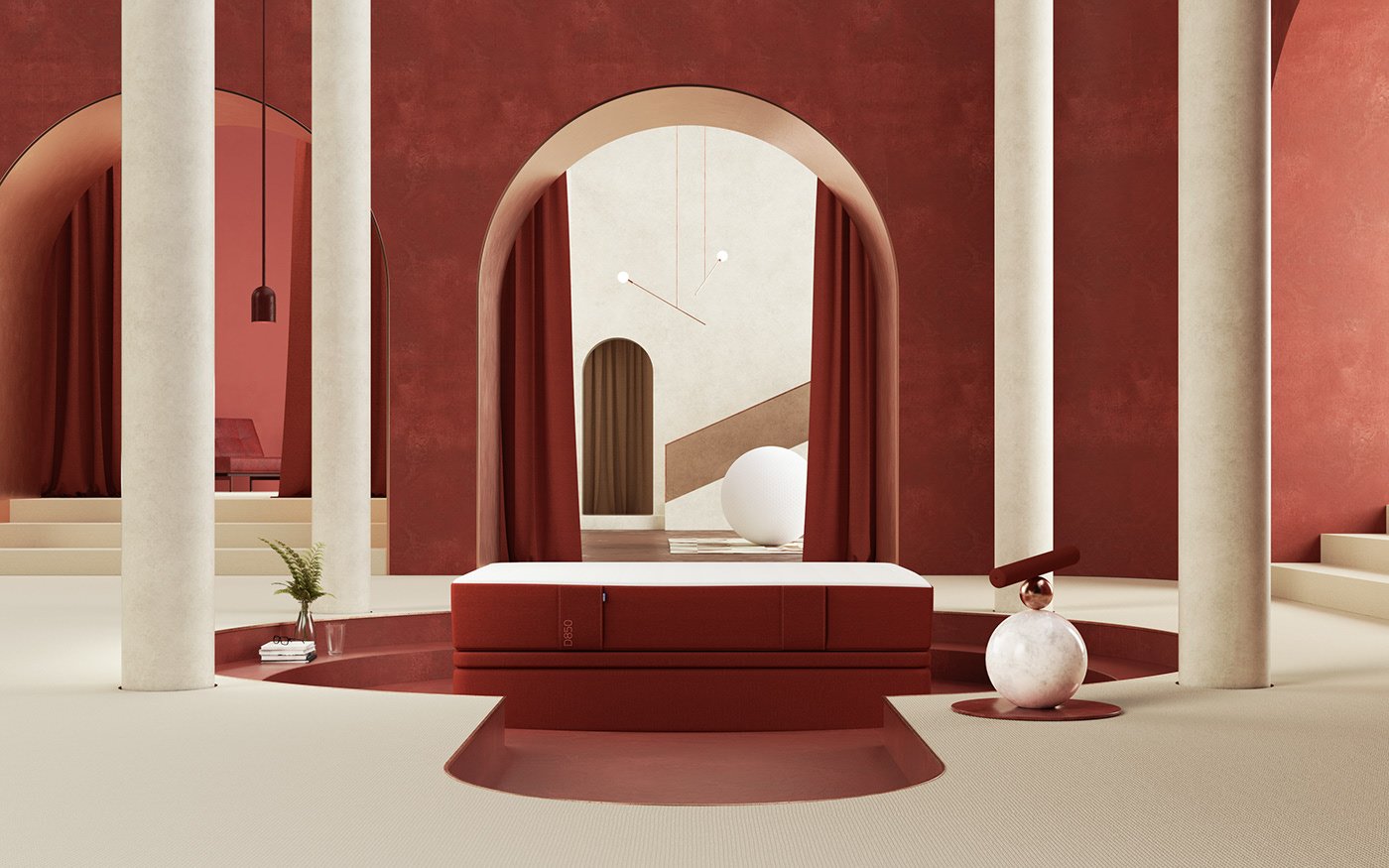
colour in relationship
colour considered through relationships, proportion and light. a practical study of tonal, neighbouring and contrasting palettes from our 2019 archive.
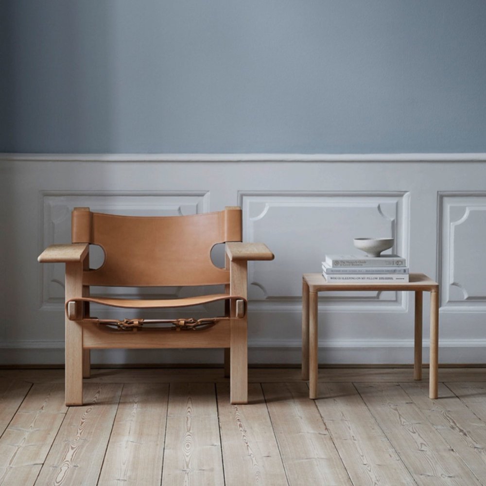
depth in a neutral palette
earthy tones and muted green through furniture, art and lighting. a 2019 archive selection exploring the material depth of a neutral palette.
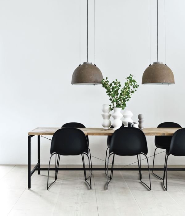
a more considered beginning
colour, natural materials and more deliberate selection. a fresh look at five design considerations from our january 2019 archive.
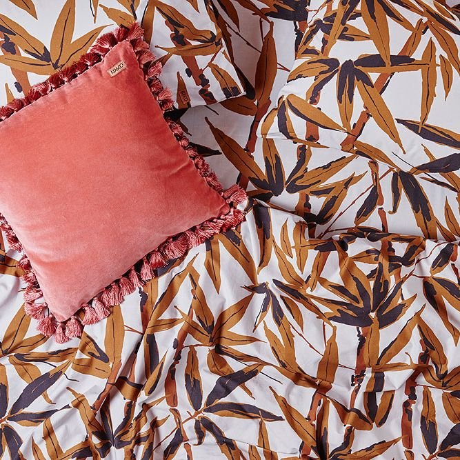
coral within a considered palette
living coral through finishes, textiles and art. a study from our january 2019 archive, considering warm colour within the broader material palette.