
edition
notes on materials, objects and the details that shape an interior. from our essendon studio, we consider colour, craft and the relationship between a home and the people who live within it.
selected references from our design archive, revisited through a contemporary perspective.
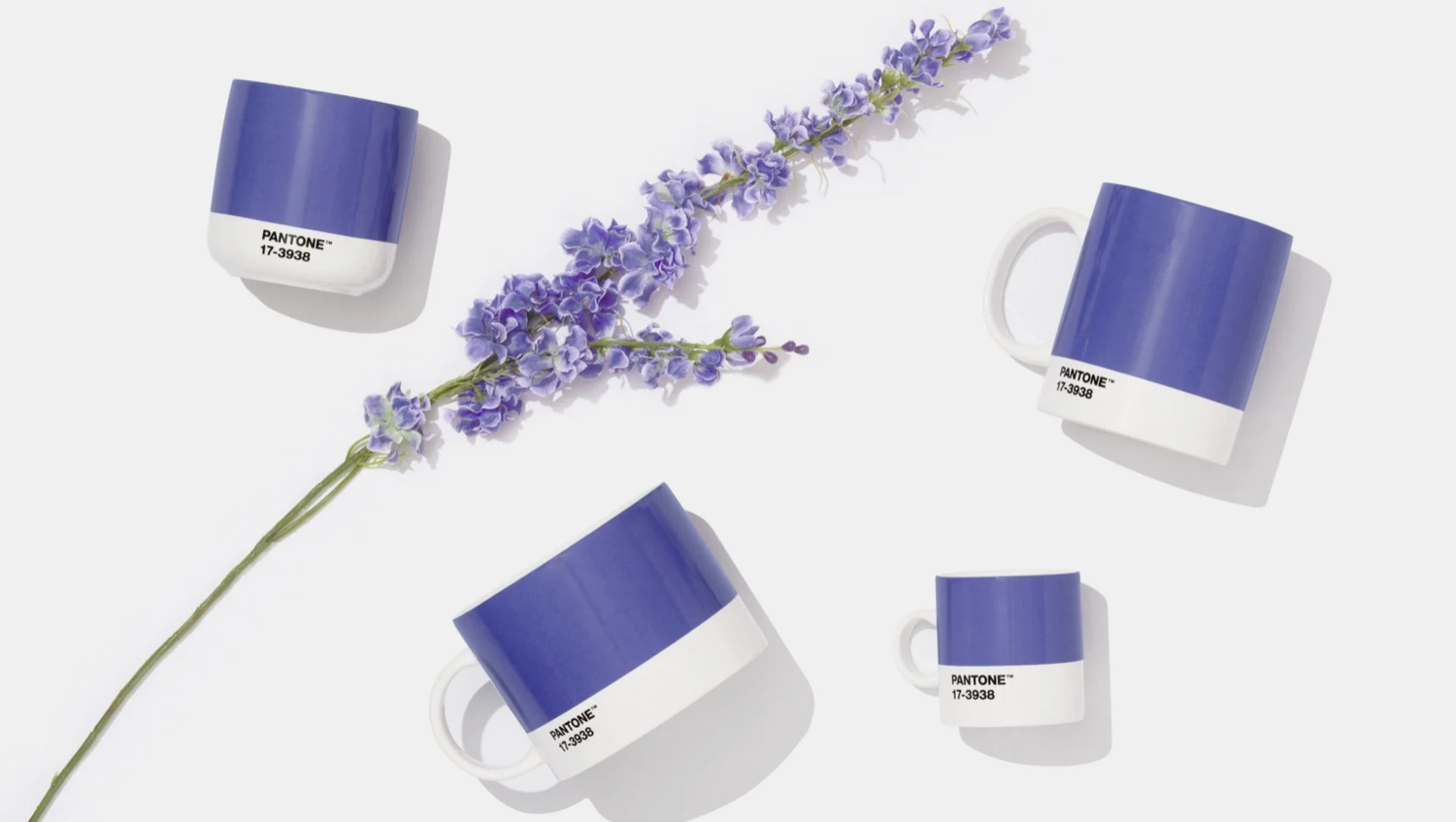
very peri: a study in colour
pantone’s 2022 very peri revisited through undertones, materials and the scale of colour within an interior. a reference from our design archive.
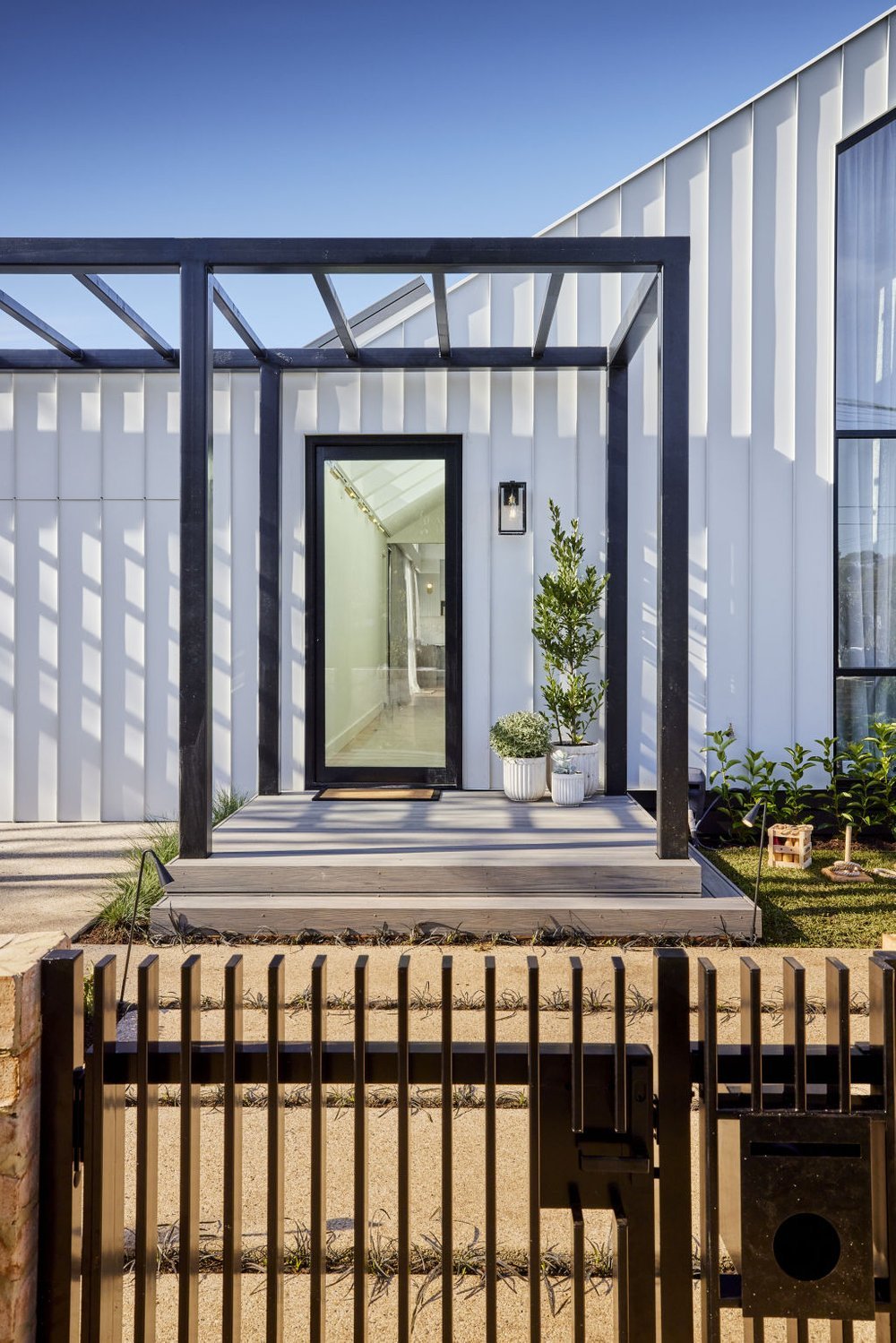
five details, considered
upholstery, daylight, wall detail, bathroom materials and the entrance. five design references from the block’s 2021 season, reconsidered.
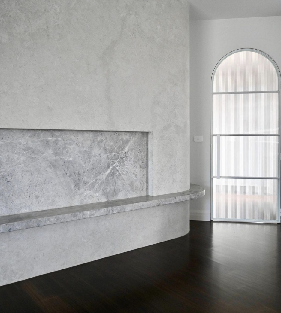
curves within the architecture
curves can guide movement, frame a view and give joinery a sculptural presence. five considered applications, from architectural openings to furniture and art.
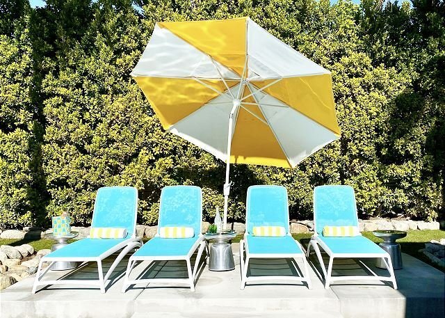
modernism, viewed through the interior
sunburst palms, seventies sackley and selected objects from our 2021 modernism week archive. architecture and decoration viewed through proportion and material.
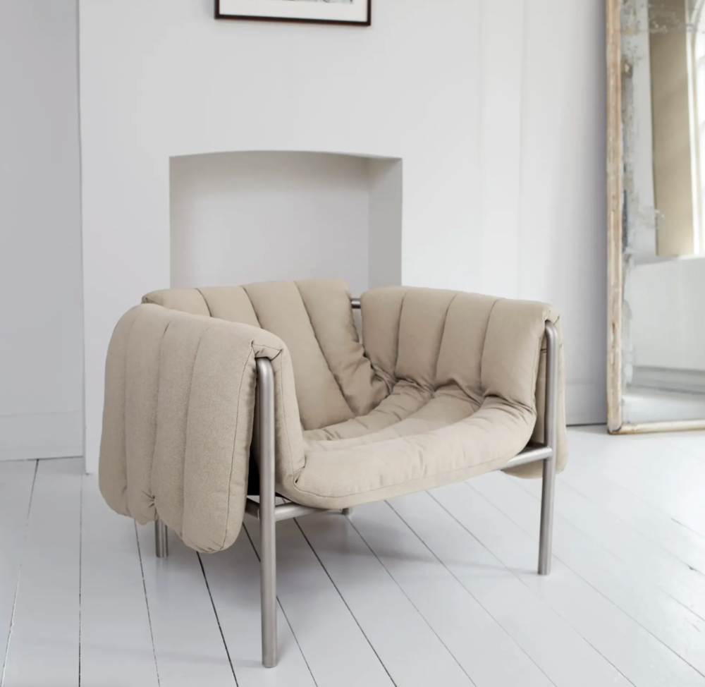
structure and surface: stockholm 2021
five furniture and object references from stockholm design week 2021. a conversation between structure, surface and sculptural form.
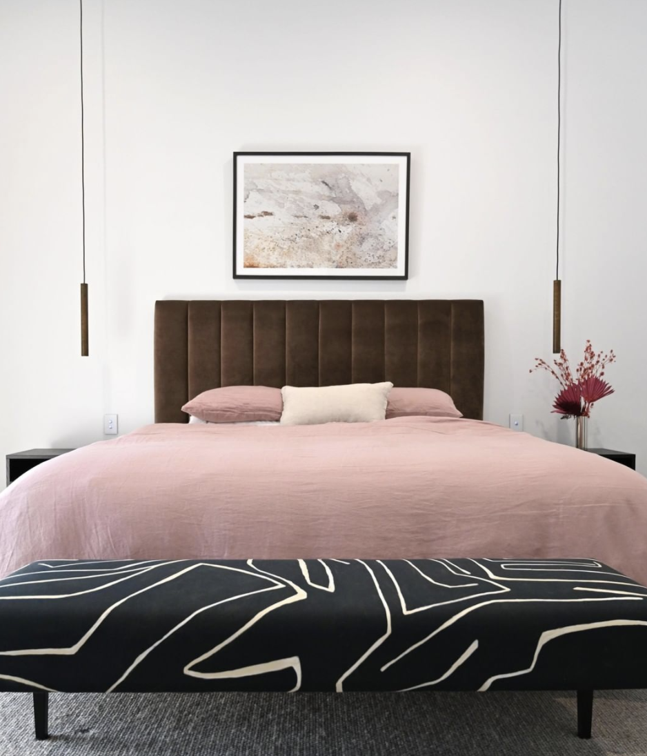
warmth in the smaller details
warm colour, tactile fabrics and more intimate light. personal finishing details drawn from our valentine’s day 2021 archive.
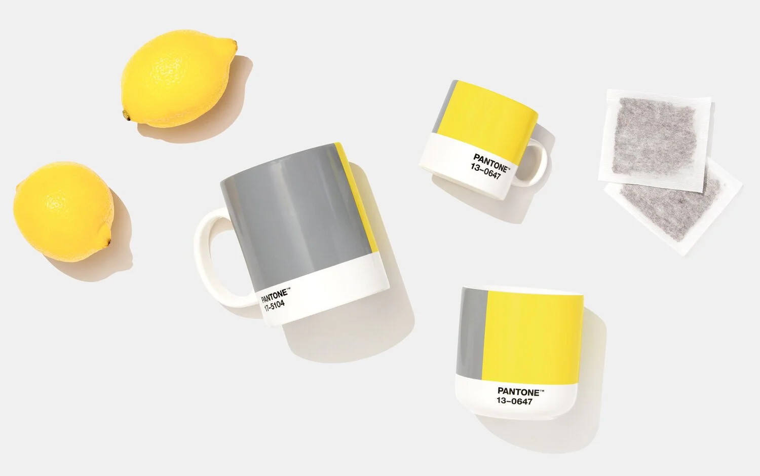
grey and yellow, in conversation
ultimate gray and illuminating, revisited through contrast, undertones and scale. a paired palette from our january 2021 archive.
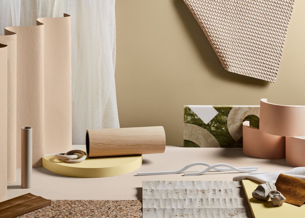
colour in context: dulux 2021
retreat, nourish and reset: dulux’s 2021 palettes revisited through the relationships between colour, light and existing materials.
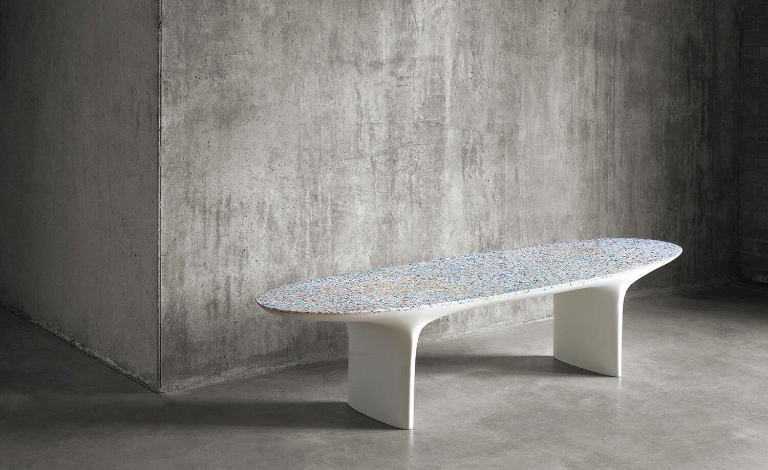
a closer look at materials
natural fibres, recovered materials and the questions behind a considered selection. an updated look at references from our 2020 archive.
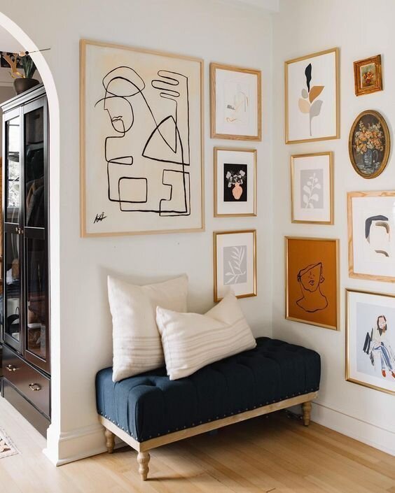
small shifts within the interior
reconsider an arrangement, give art its place and layer colour with texture. small adjustments that begin with the pieces already within a home.
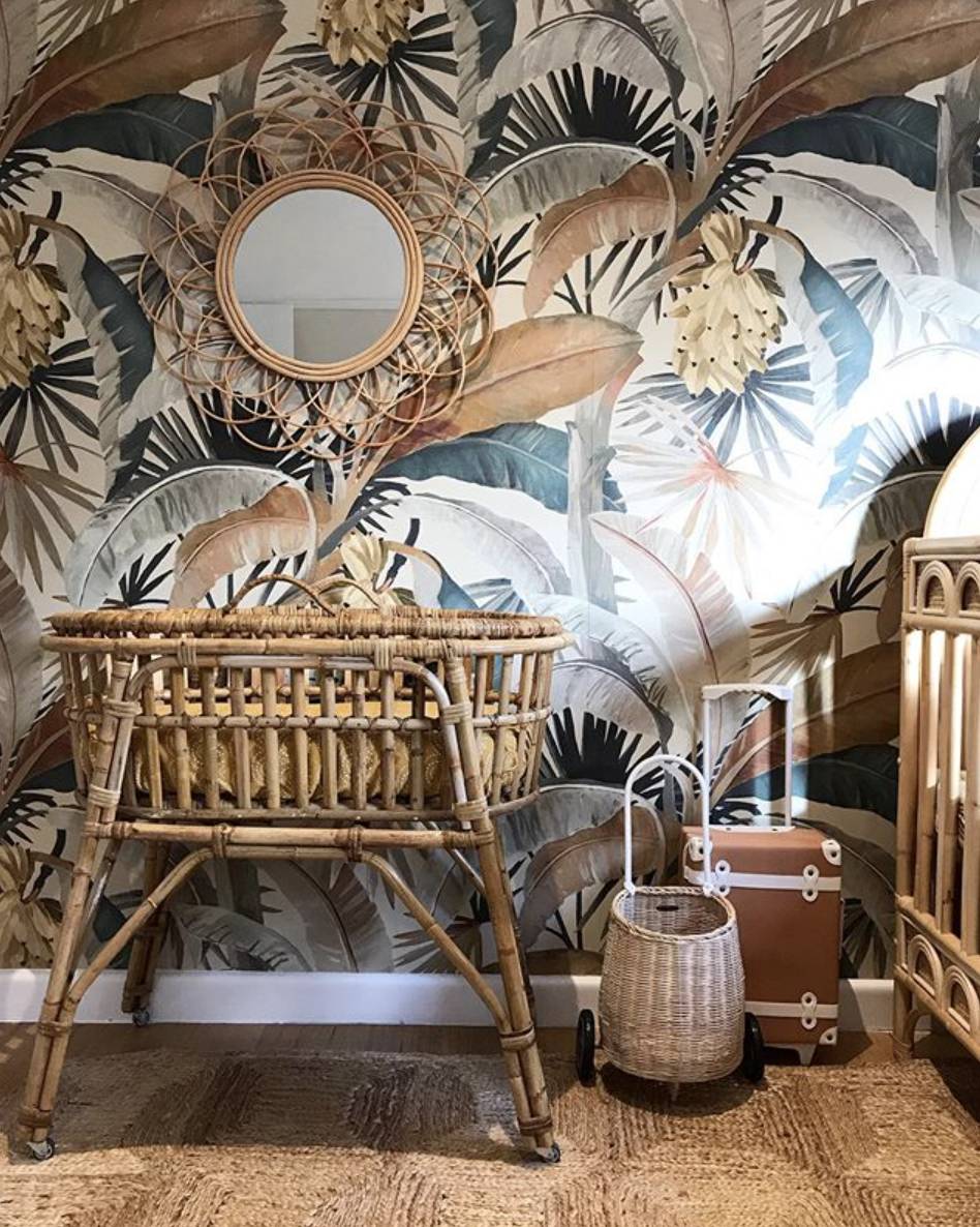
wallpaper, considered
pattern, texture and architectural setting: selecting a wallcovering as part of a complete interior, with practical attention to application and care.
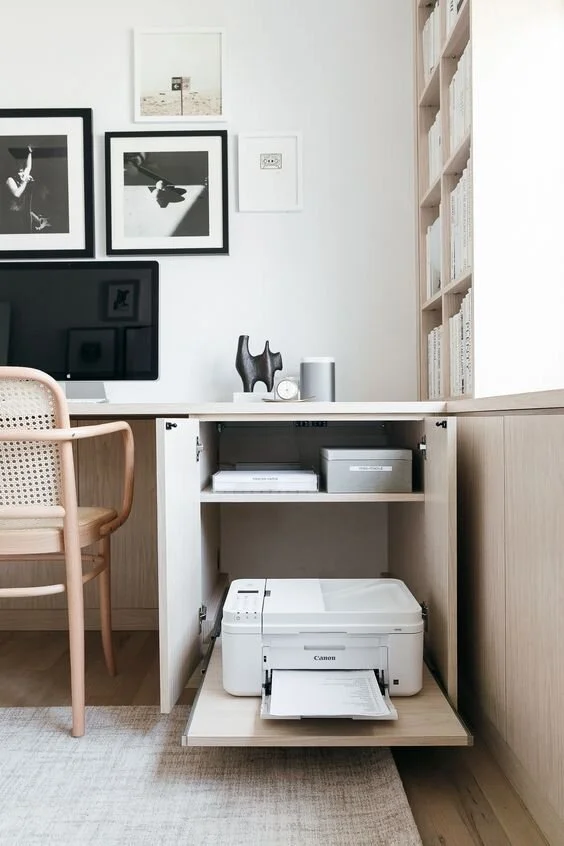
a place to work at home
planning a home workspace around daily use, with considered furniture, bespoke joinery, storage and light.

blue, at different scales
a classic blue study from our january 2020 archive. exploring colour through art, upholstery, rugs, joinery and the smaller details of an interior.
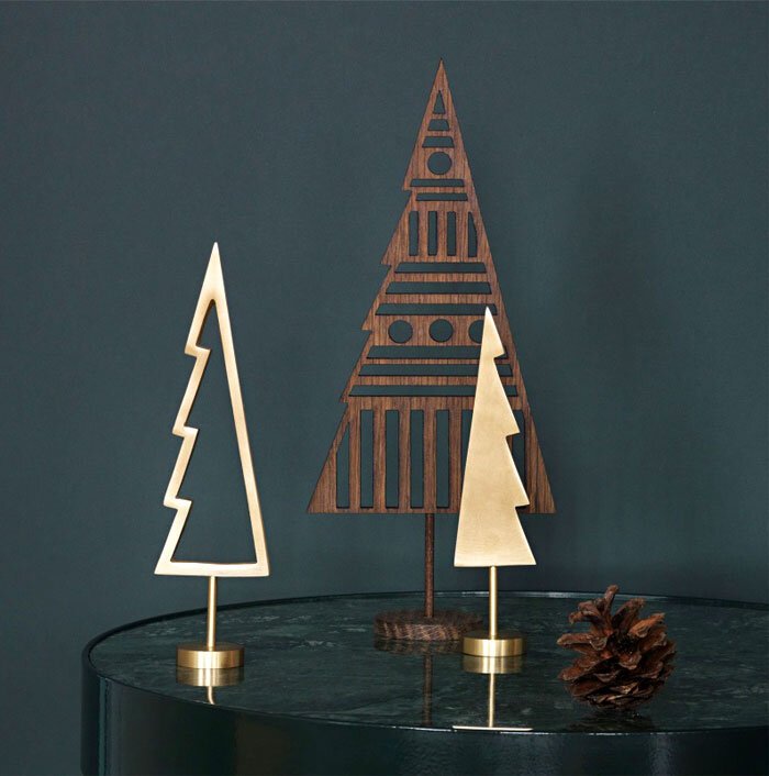
seasonal details, quietly considered
a restrained approach to festive decoration, first published in december 2019. foliage, textiles and table details that belong within the home.
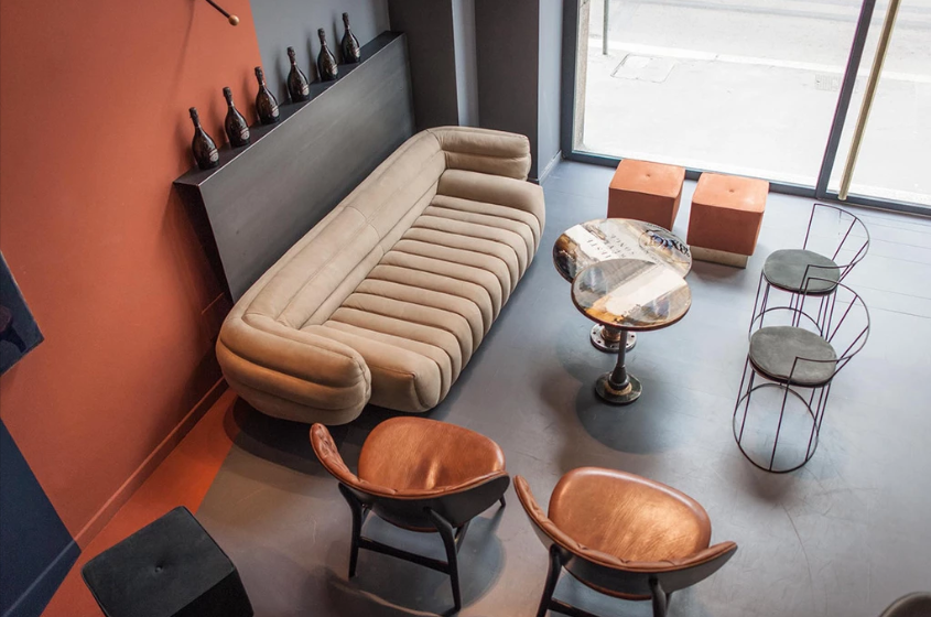
the rhythm of pattern
pattern through fabric, furniture, rugs and tiled surfaces. eight references from our december 2019 archive, considered through scale, repeat and placement.
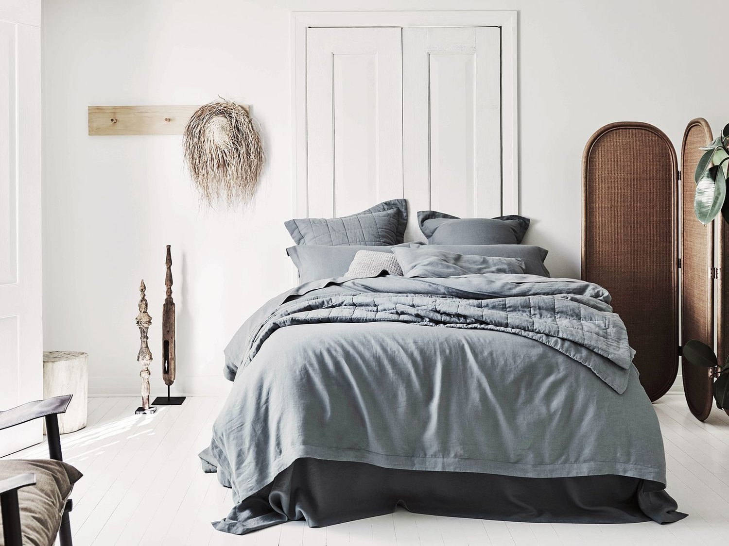
the quiet character of linen
linen’s weave, colour and soft fall bring a quiet texture to an interior. selecting fabrics for bedding, upholstery and custom window furnishings.
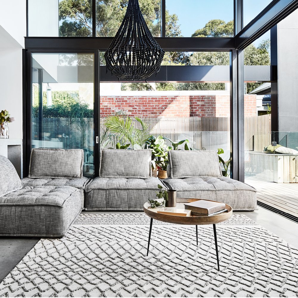
the rug within the room
scale, shape and material work together to give a rug its place within the room. considered selection alongside furniture, colour and everyday use.
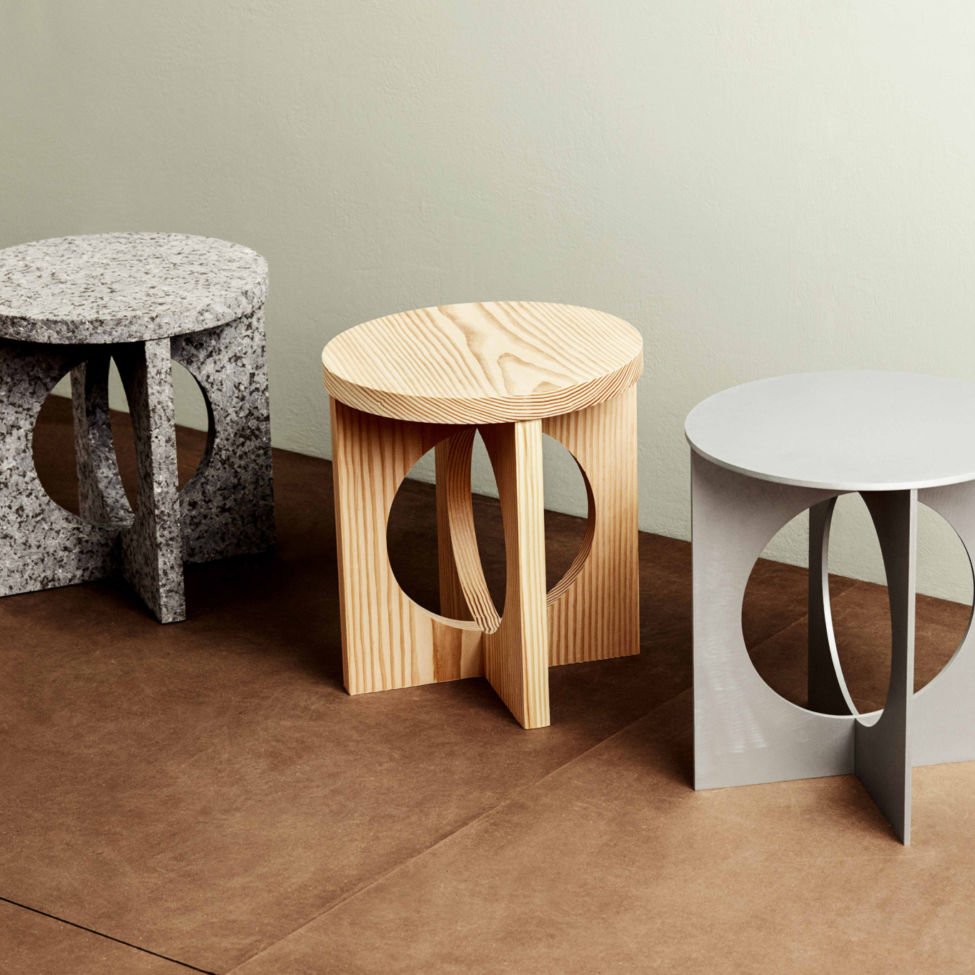
milan 2019: form and material
furniture, lighting and surface references from our milan 2019 archive. a study in sculptural form, material relationships and the detail of making.
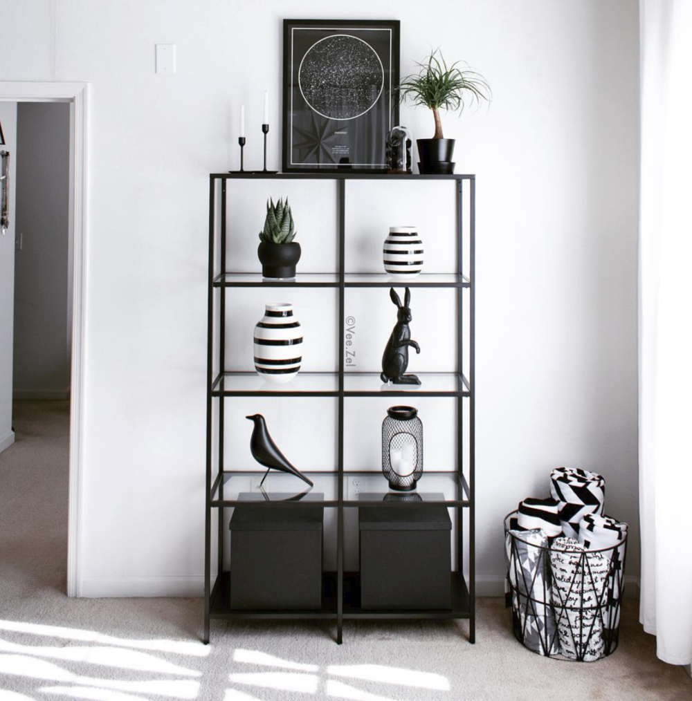
pale colour and seasonal details
pale colour, rounded objects and a considered table setting. a seasonal styling study from our april 2019 archive.
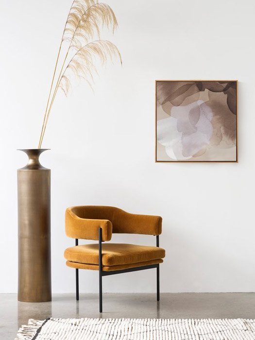
warmth through form and material
warm colour through metal, timber, upholstery and art. furniture references from our april 2019 archive, considered as part of a lasting interior.